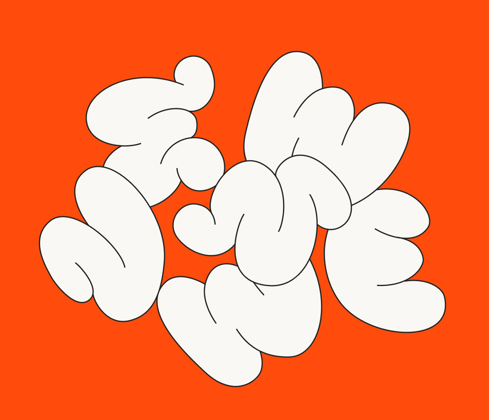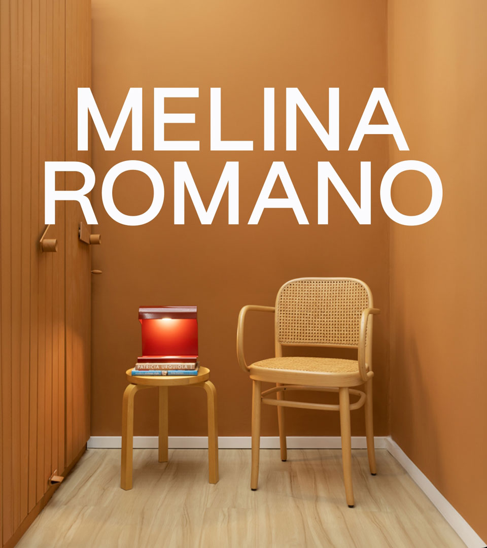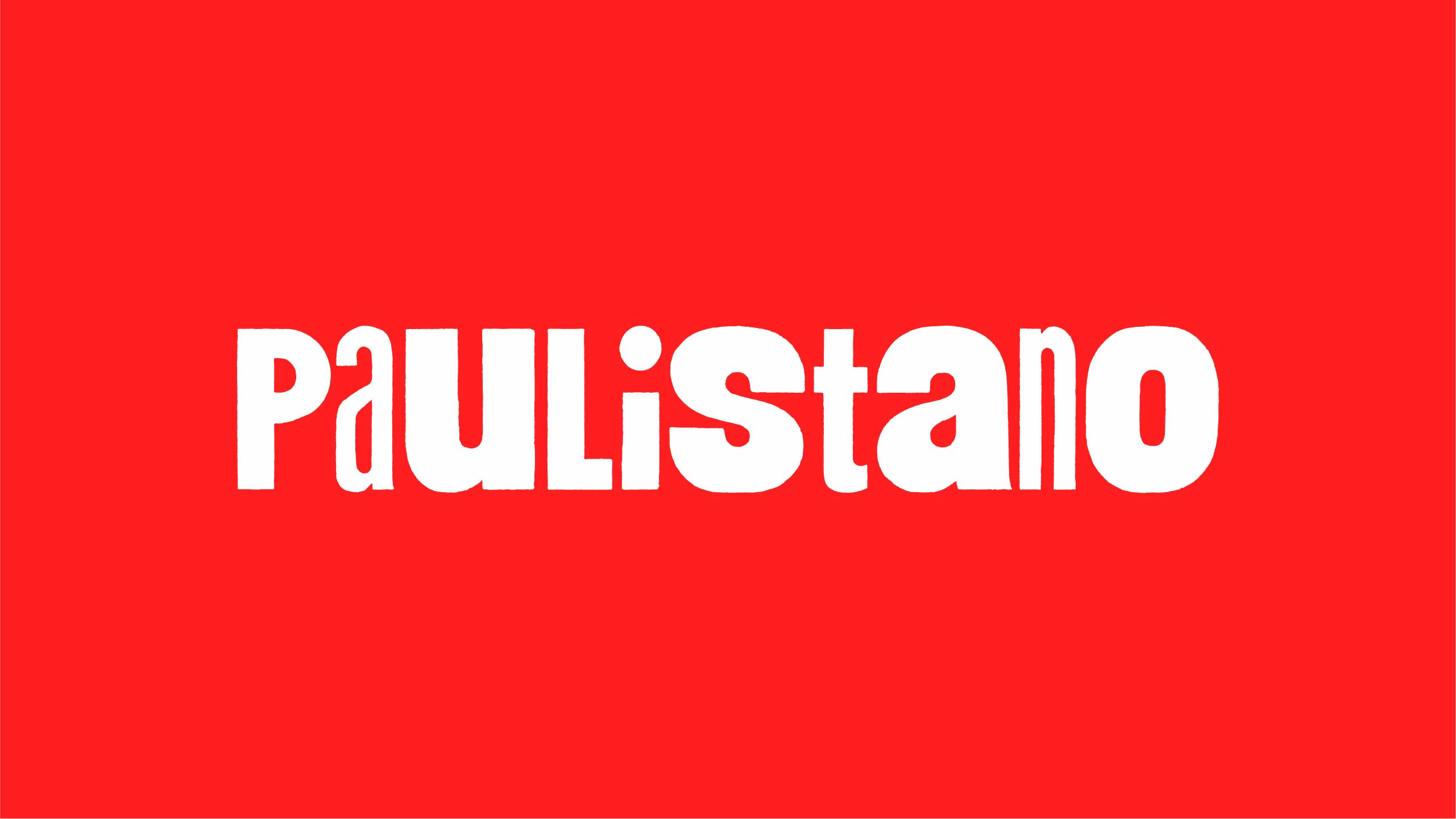

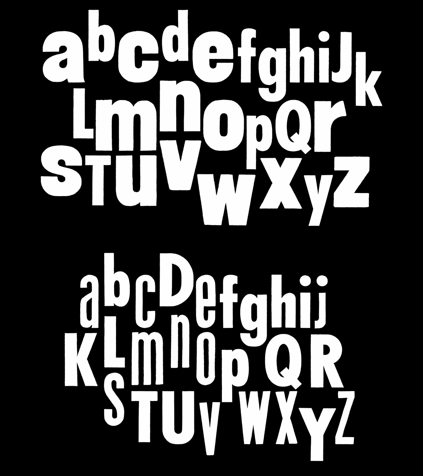
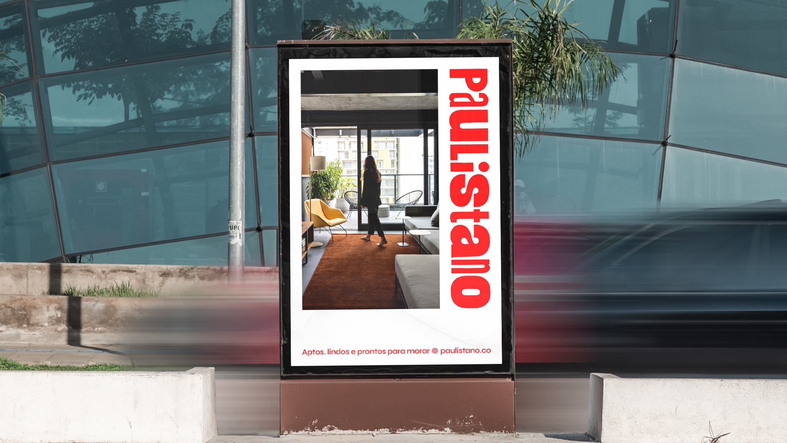
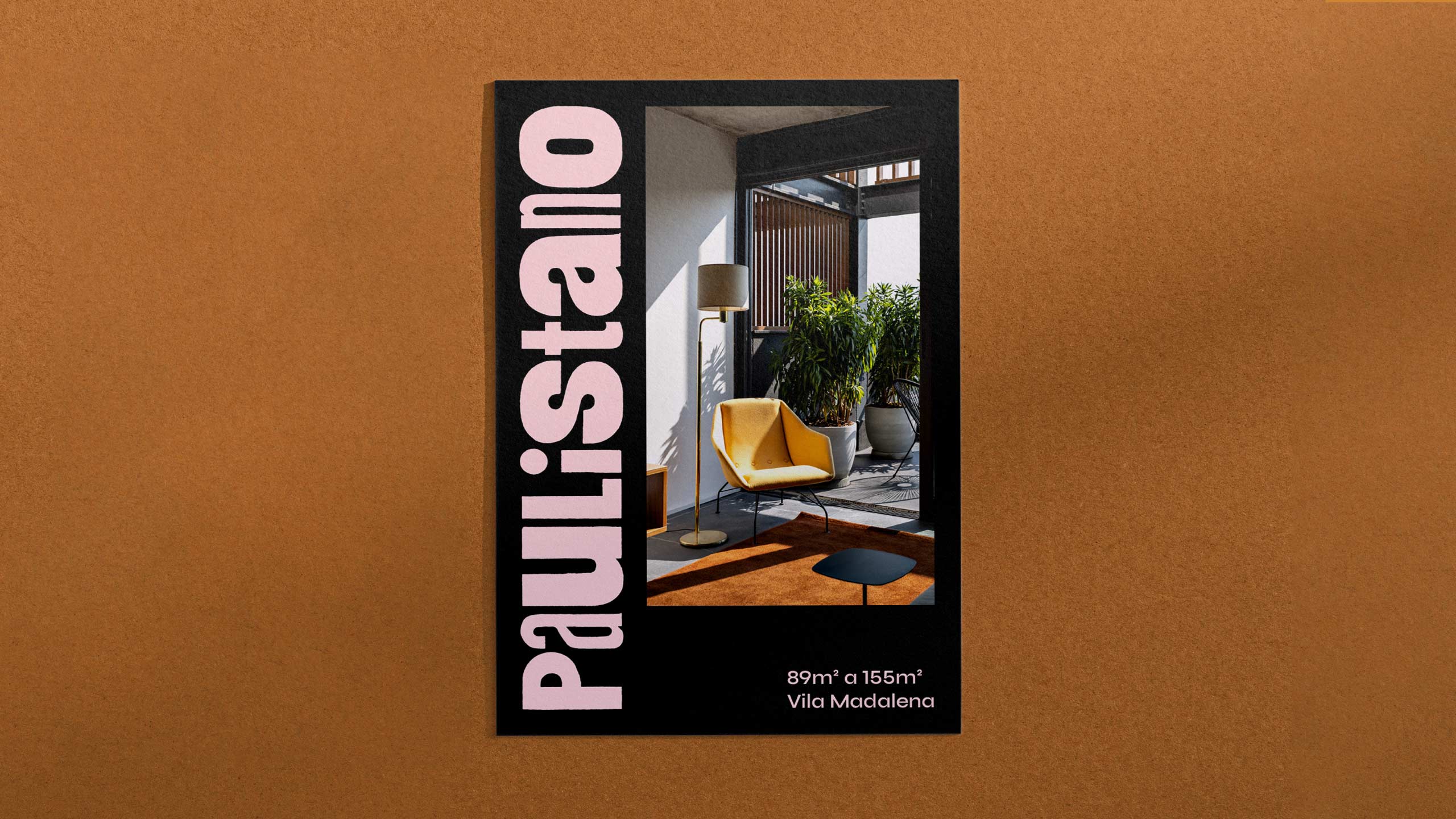
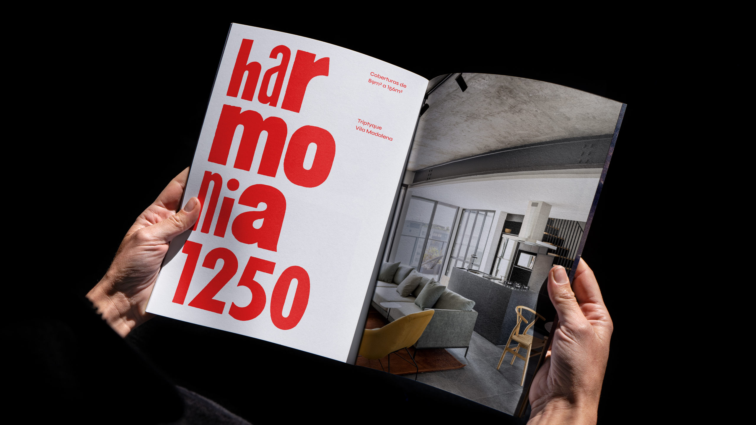
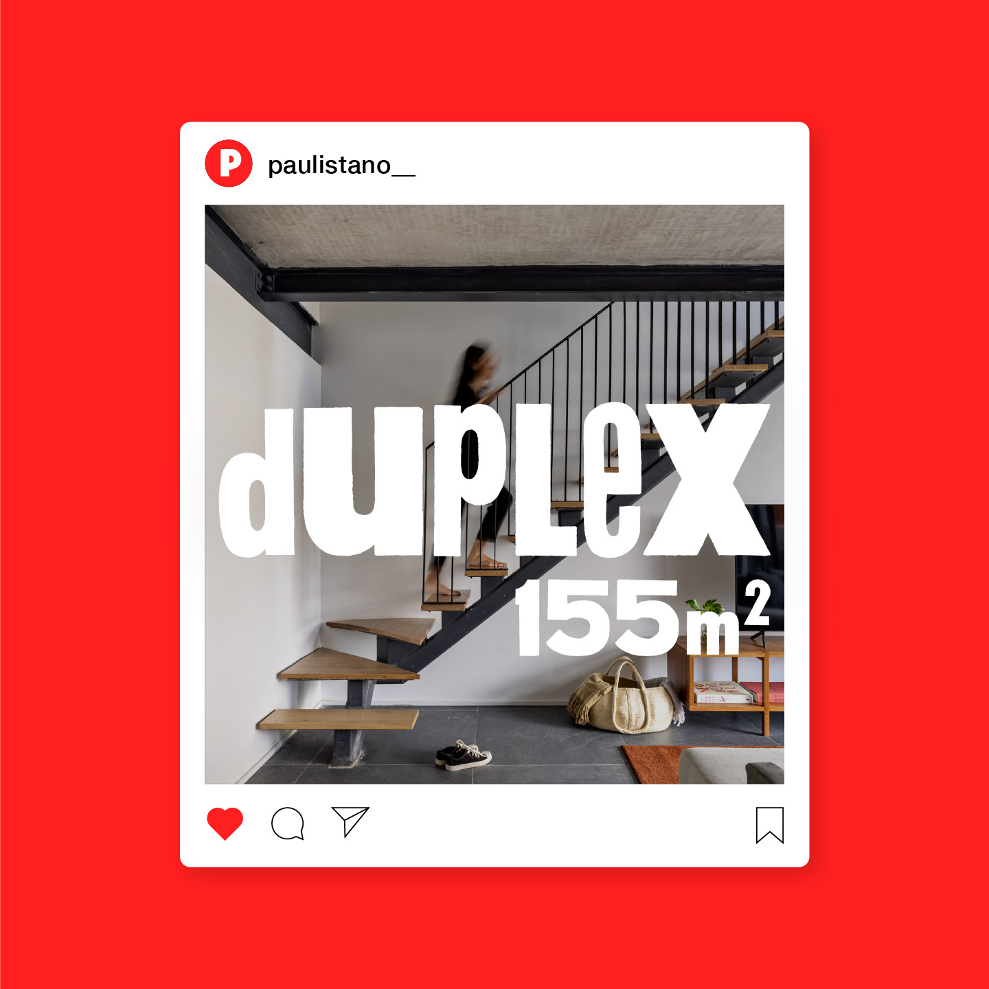
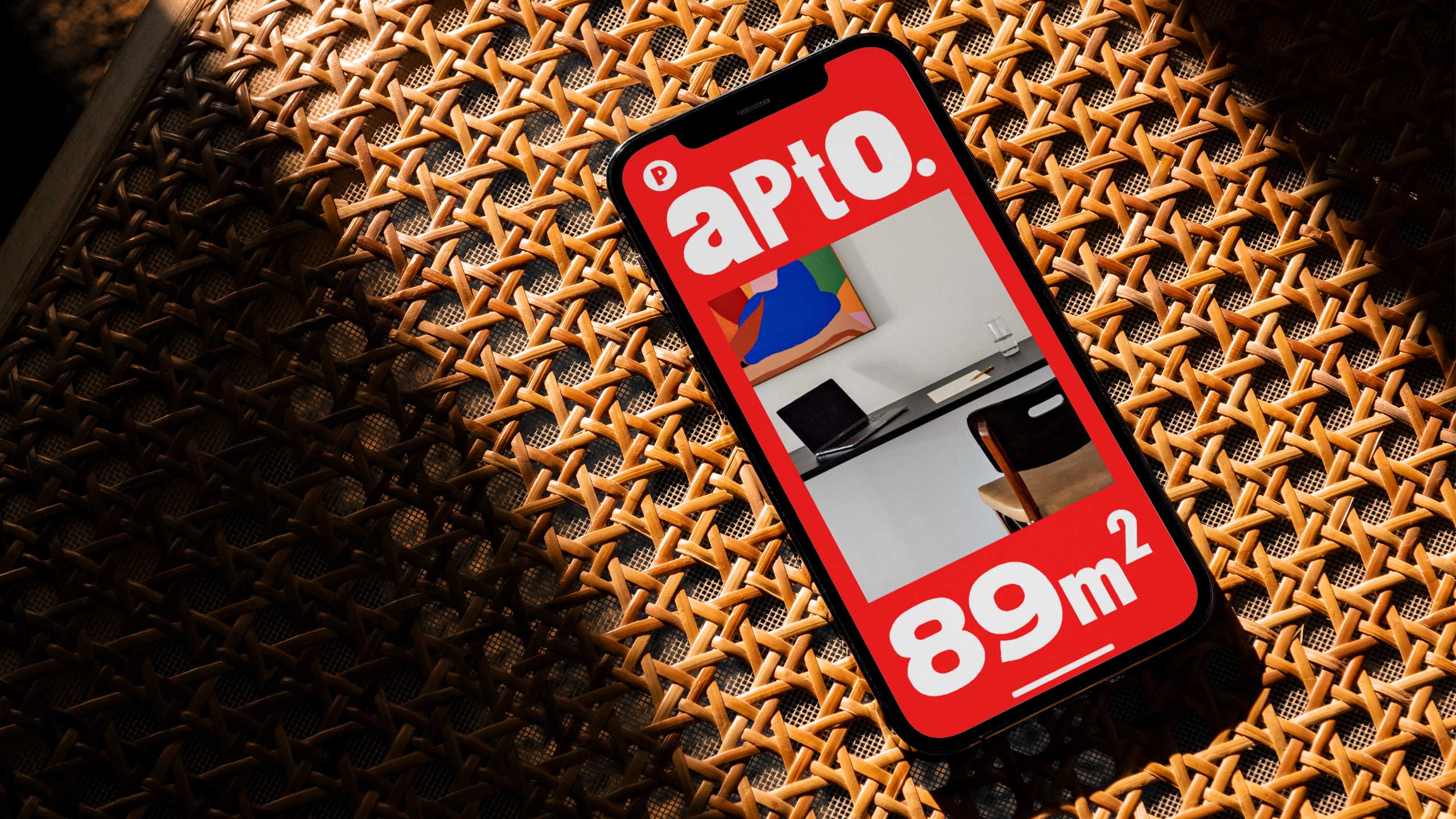
Paulistano is a company that rents ready-to-live-in apartments in São Paulo. What makes the places special are interior design projects that combine contemporary furniture with vintage objects. We chose to highlight this feature through a custom font, created using letterpress printing to enhance imperfections and unusual combinations.
VISUAL IDENTITY
2021



Info
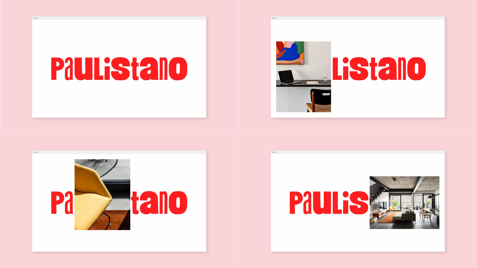
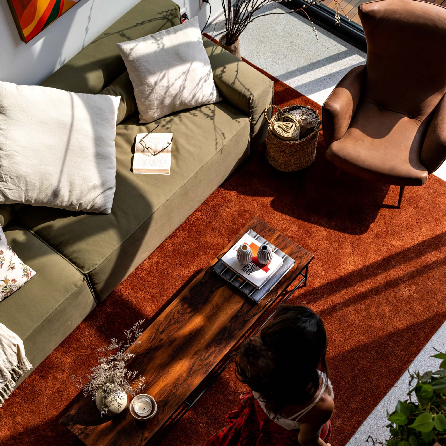
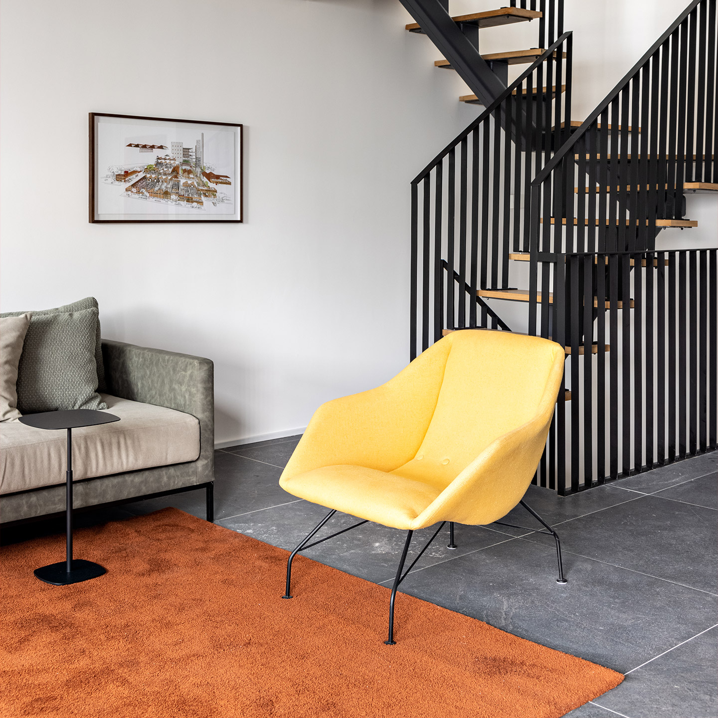
Paulistano has a specific criteria for locating its units: new buildings with contemporary architecture. Their apartments and lofts are move-in ready and can be rented for short or long periods. But what makes the places special is the interior design of the apartments that combines contemporary furniture with antique objects, carefully mined to bring a human touch to each room. Our choice to express this important feature was a custom typography that values imperfections.
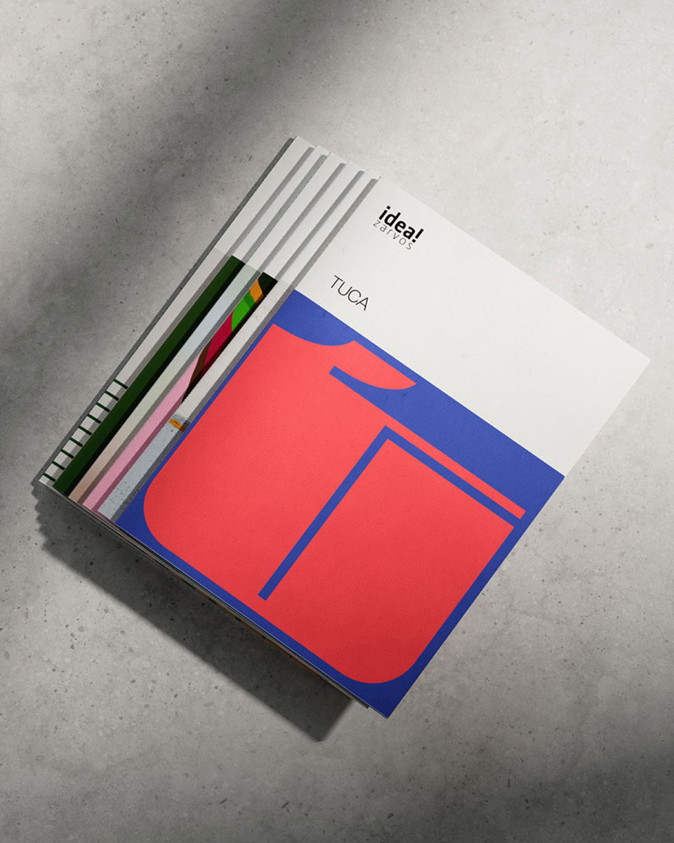
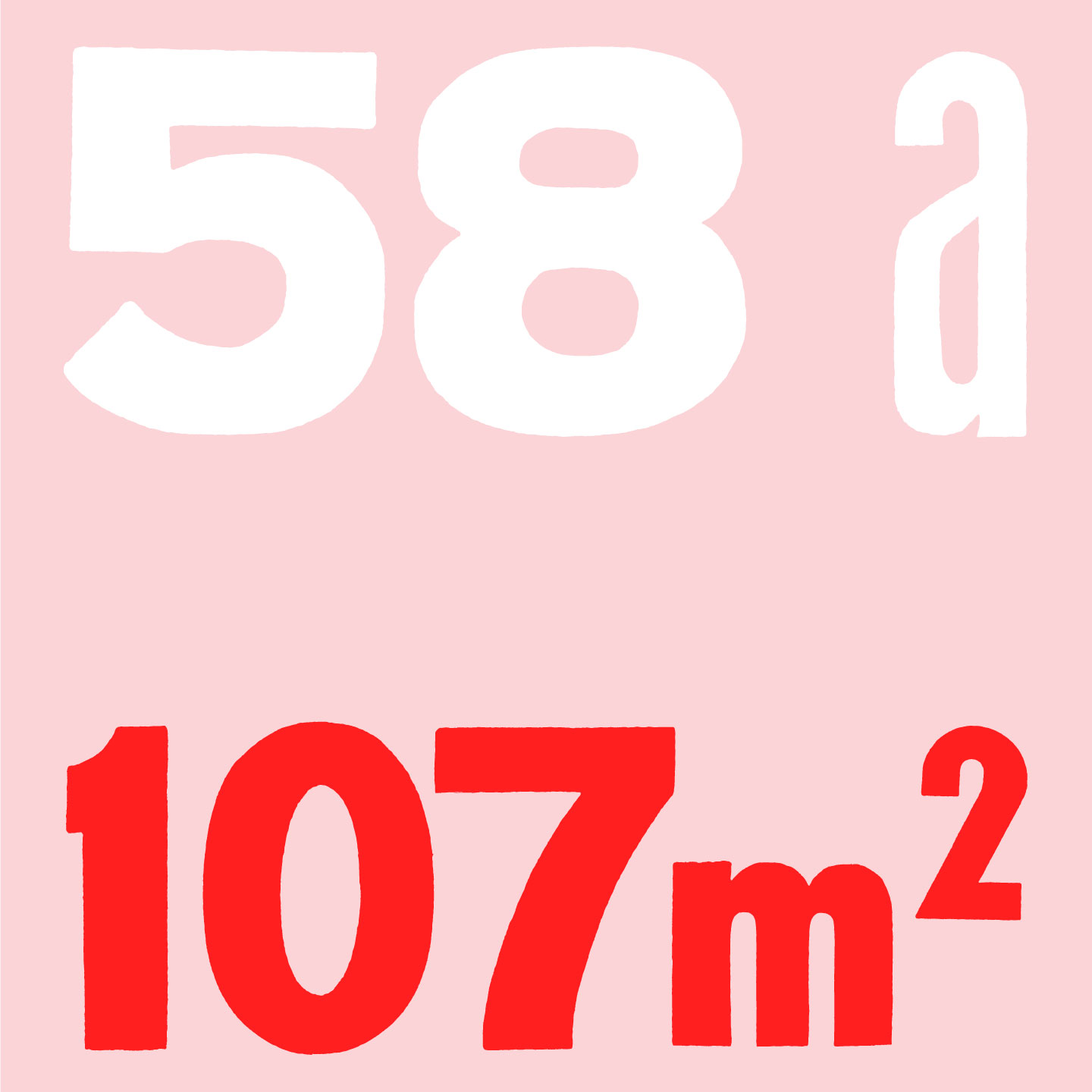
Back in 2015, through an experimental process at the SENAI's typography workshop, we combined characters from different sets of letterpress to create Muito Sans. The hand printed sheets were scanned and the letters traced to create a font that has its value in imperfections. In 2021, we combined the condensed, extended, uppercase and lowercase letters to visually translate the concept of bringing new and old objects together inside Paulistano's apartments. Simple compositions that highlight images and typography are the final touch of the brand's visual identity.
Credits
Design
Murilo Fonseca
Photography
Fran Parente
Muinto Sans Typogaphy
Victor de Bone, Lucas Andrade, Murilo Fonseca
Video
Flipe Fiori – Dromedário Filmes

