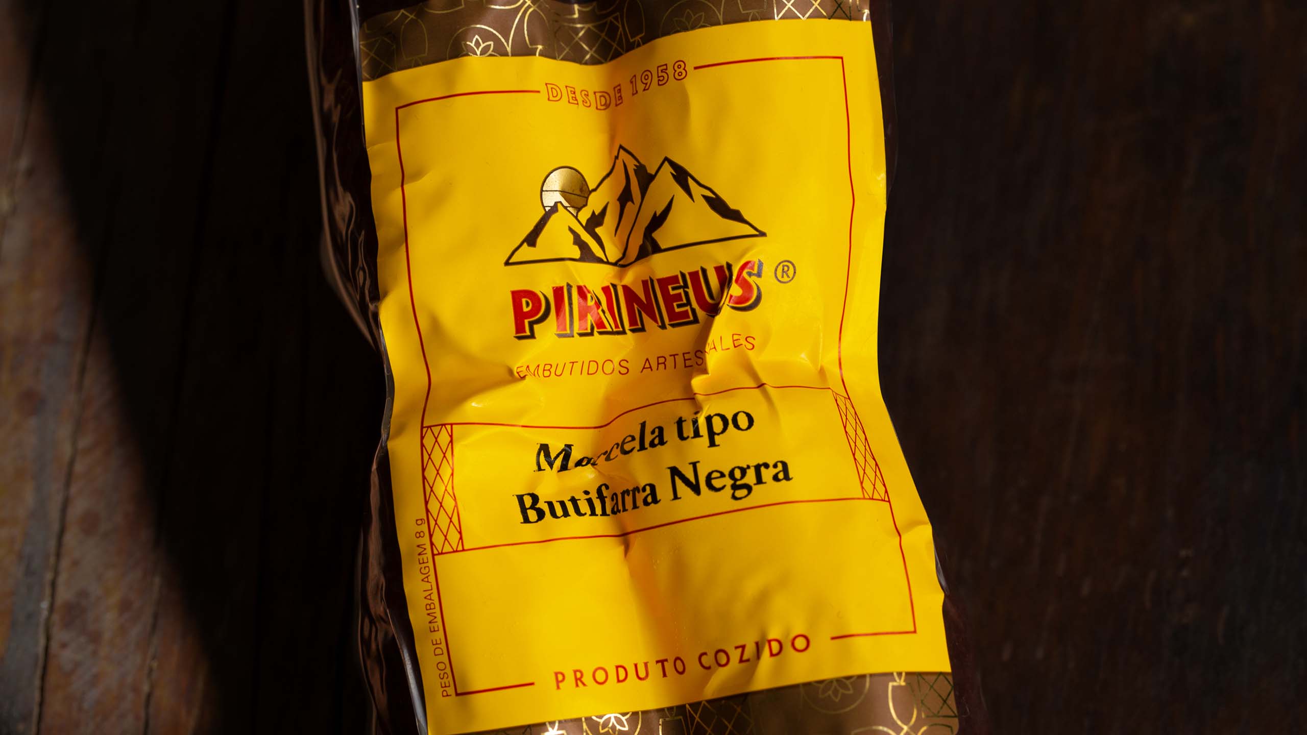

Pirineus is a family business that has been producing Spanish sausages in São Paulo for over sixty years. Through a deep dive into the universes of the company and the Ribas family, we created a new visual identity that honors the brand's history in a new and contemporary way.
VISUAL IDENTITY
2015
Info
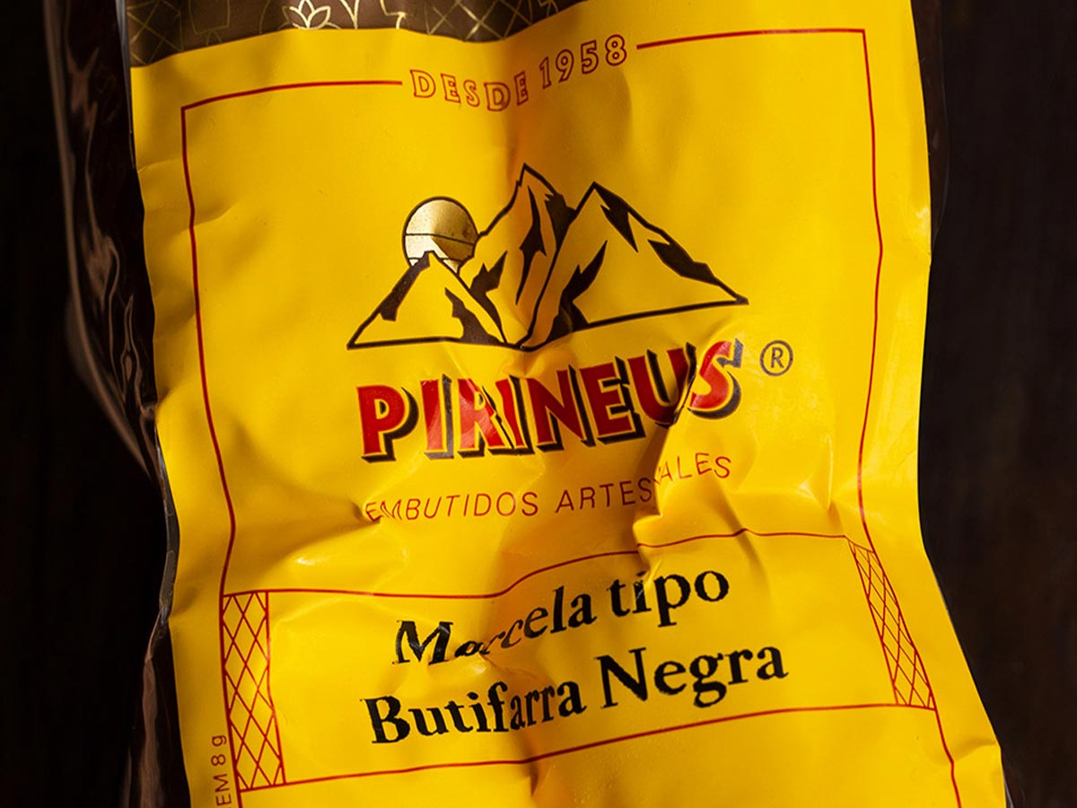
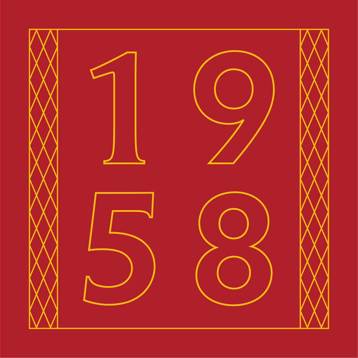
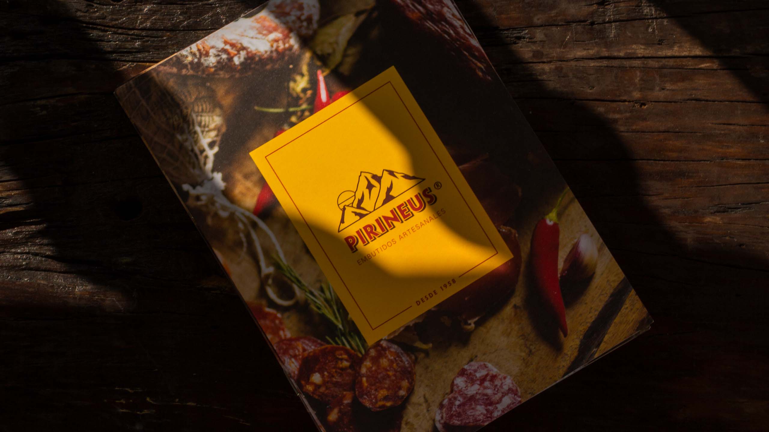
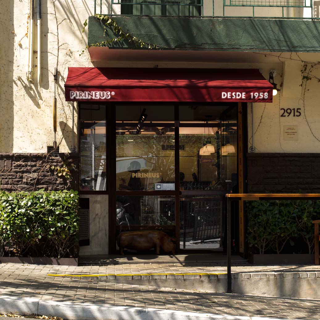
Since 1958, Pirineus has been producing artisanal sausages in São Paulo. The brand was created by a Spanish family that won a loyal base of fans in Brazil by recreating Catalonia recipes with great quality. In 2016, the family invited us to create a project to evolve the brand's visual identity. After a deep dive into Pirineus' universe we arrived at the main idea: updating the brand without losing tradition. We seek historical and cultural references to reinterpret classic Spanish elements from a current point of view.
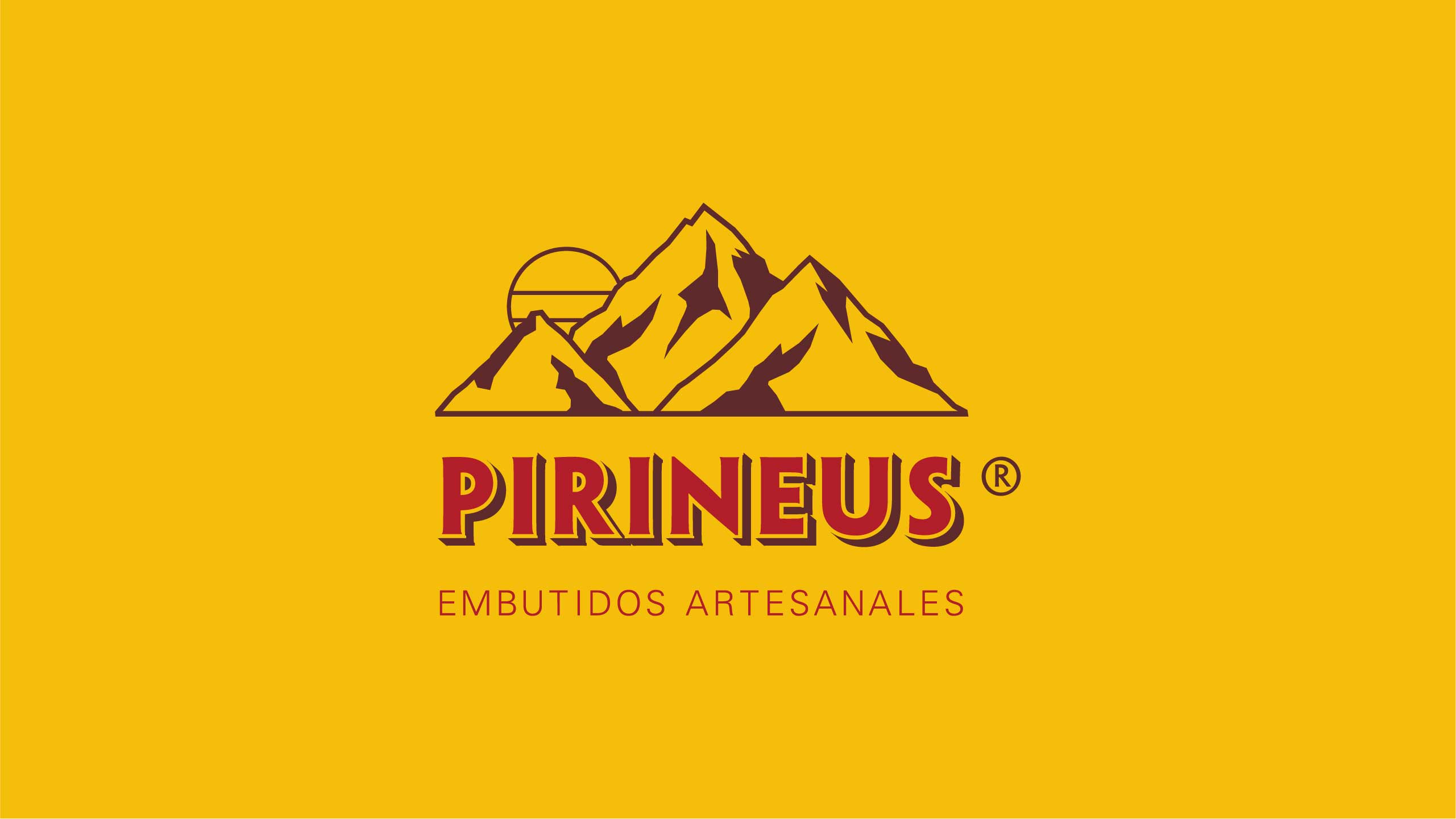
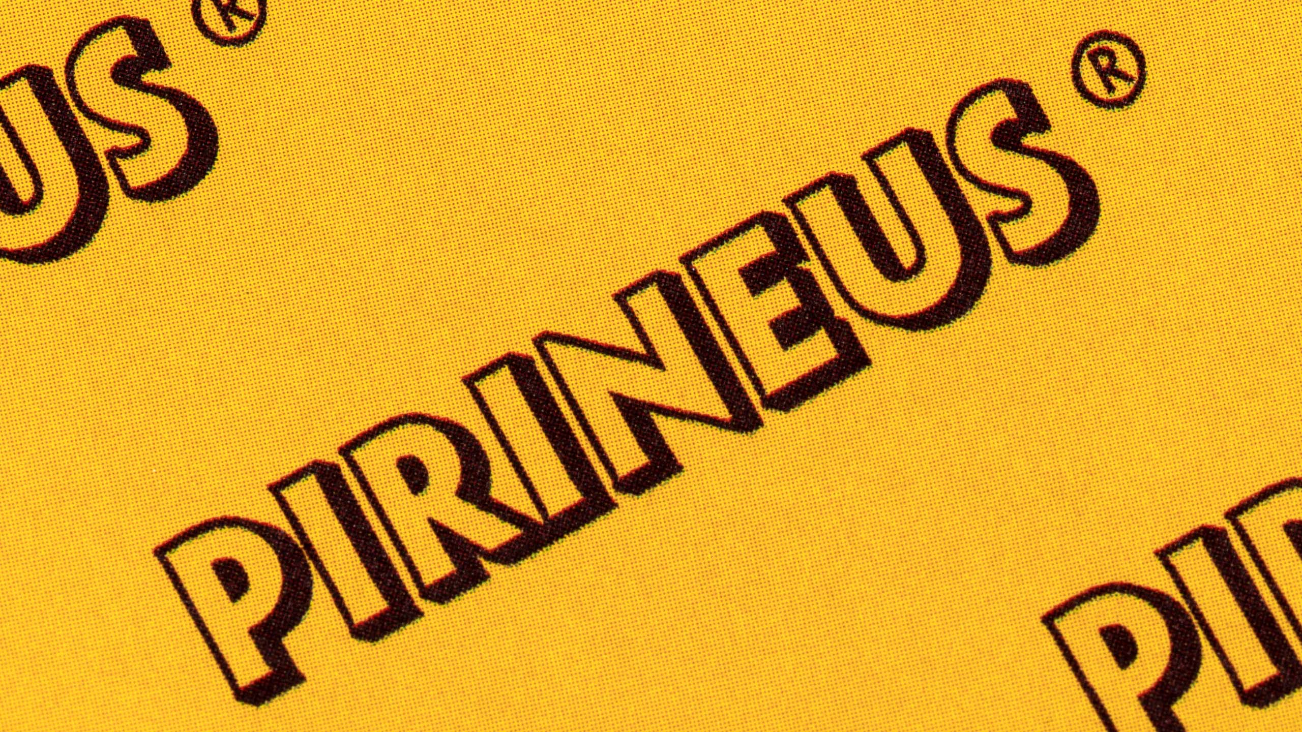
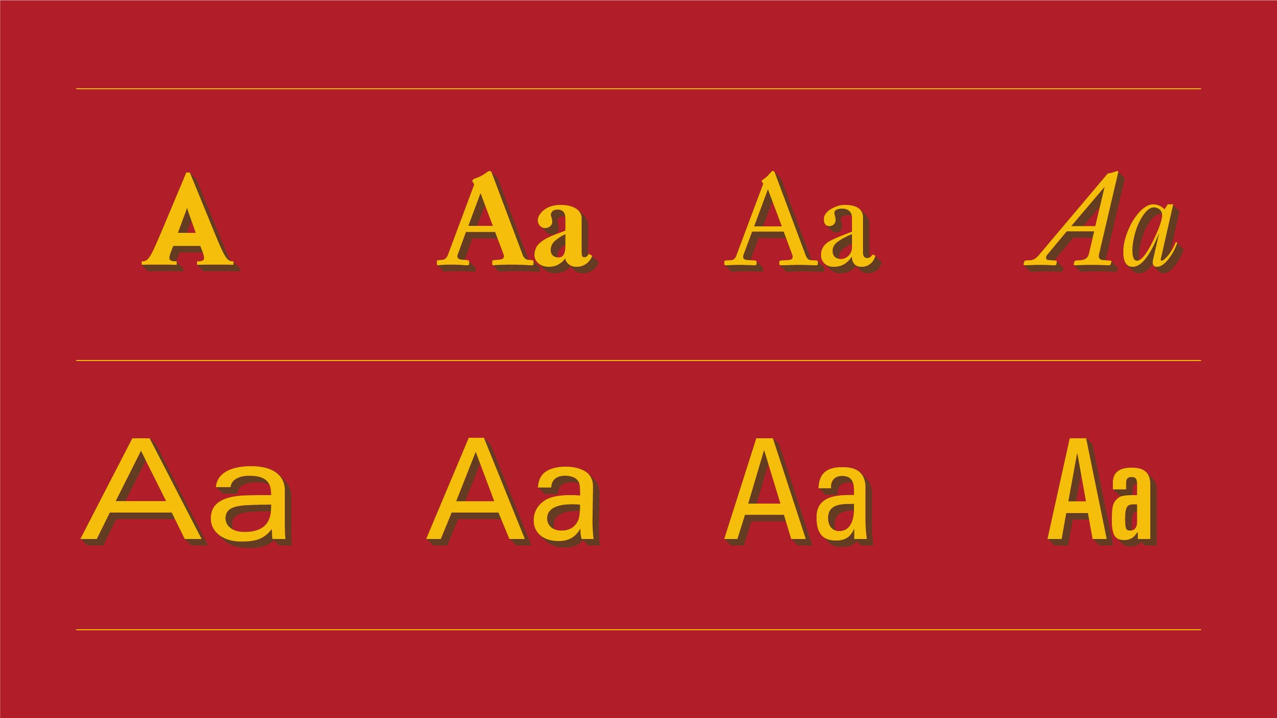
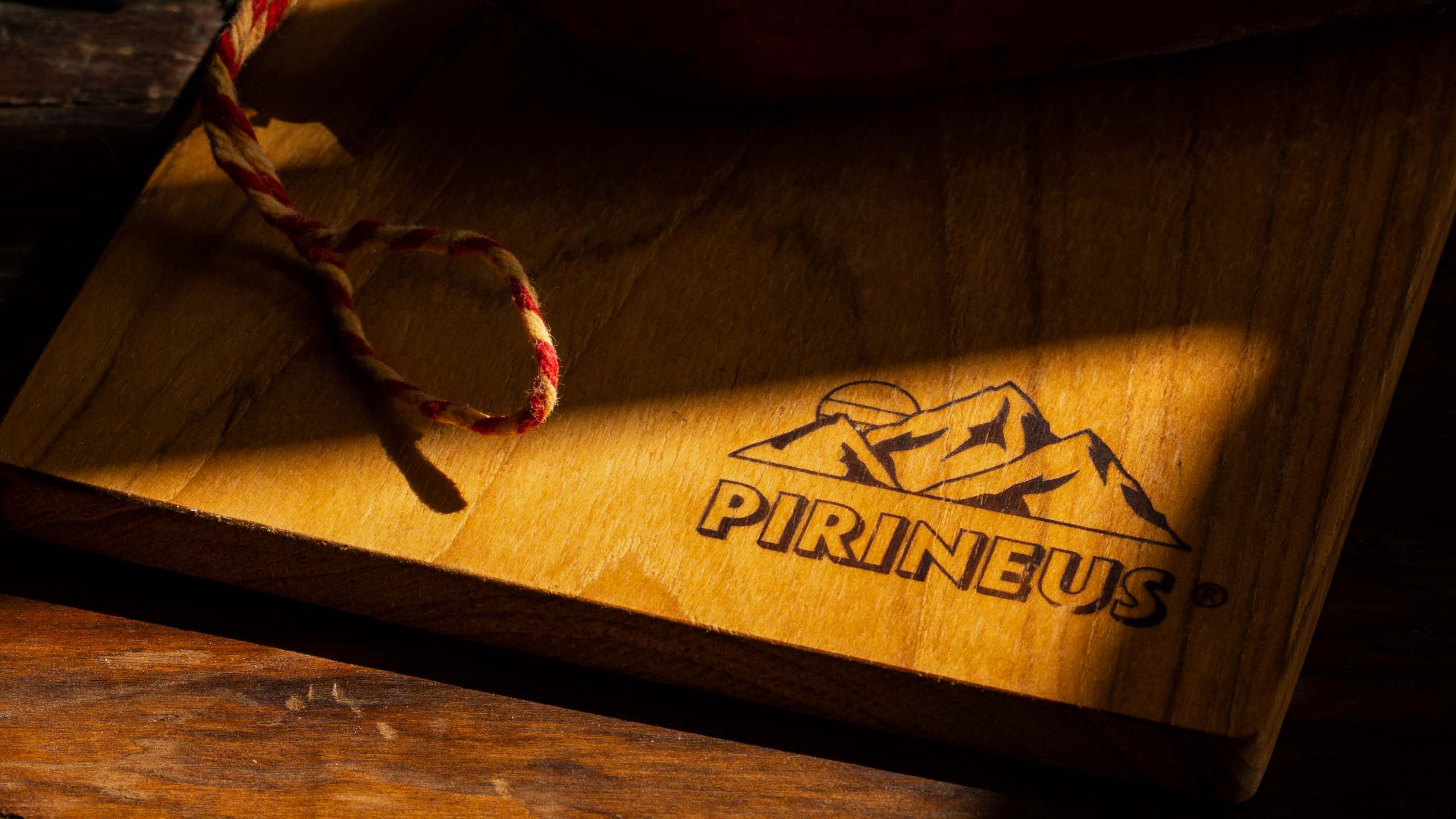
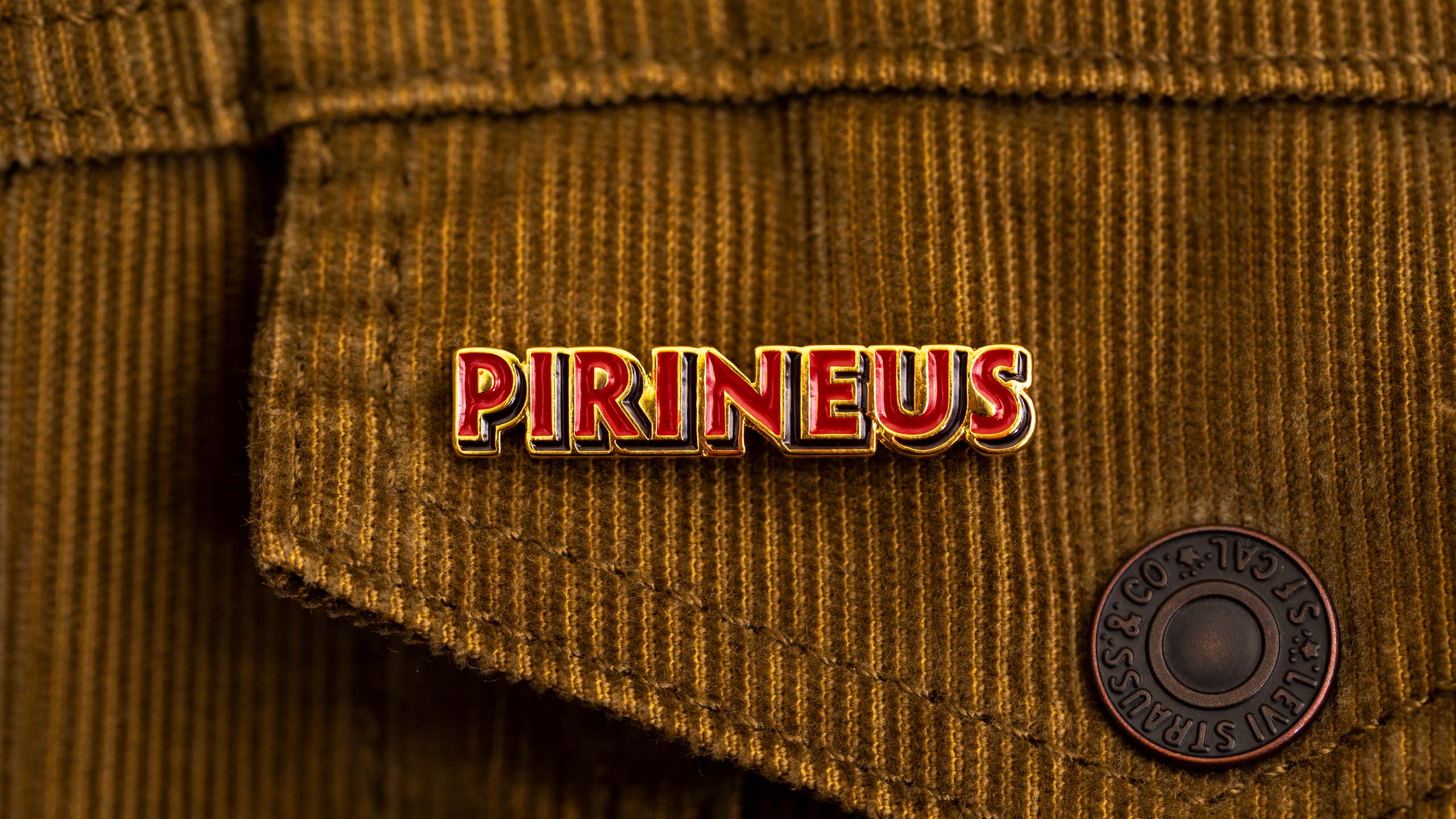
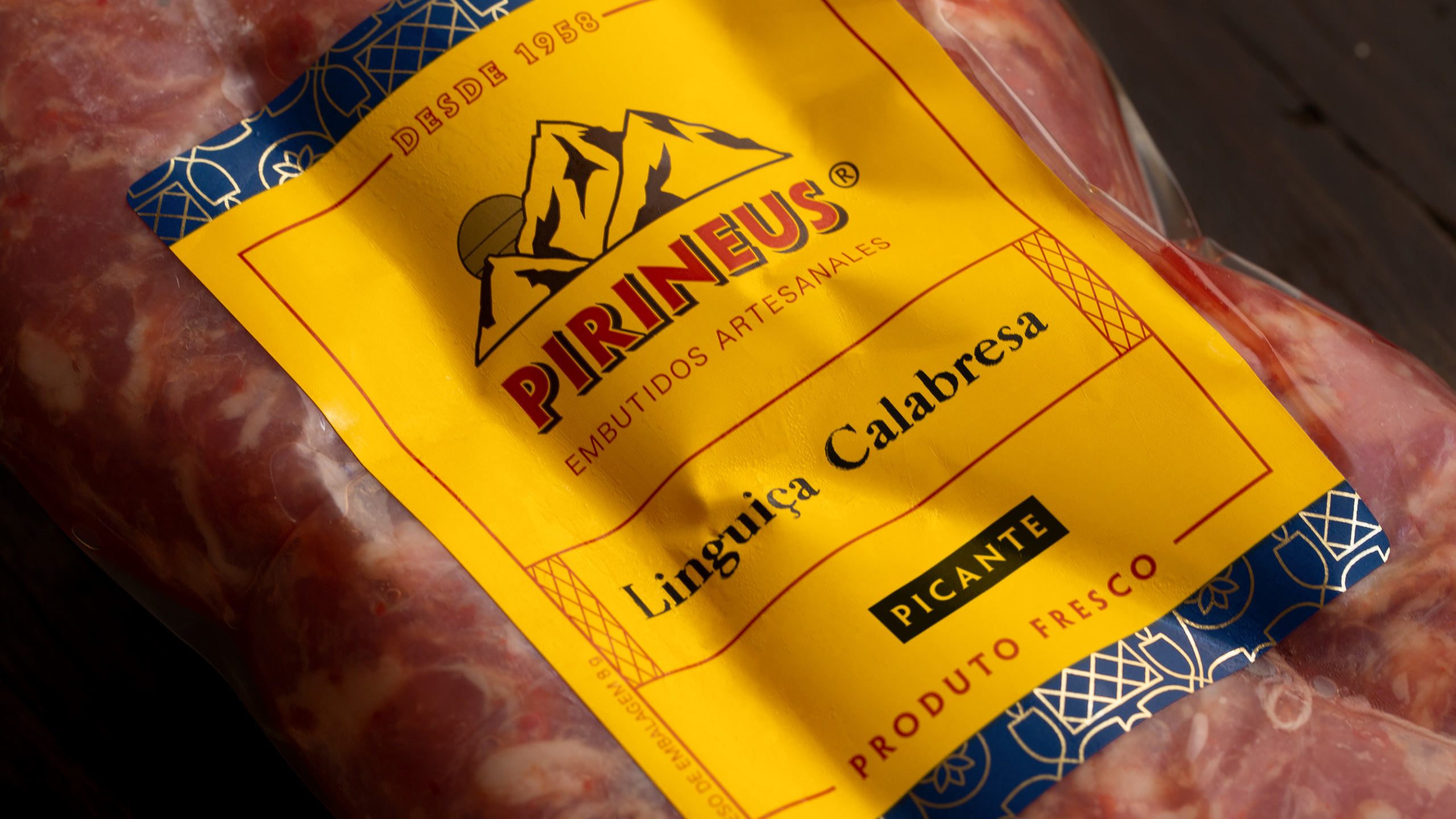
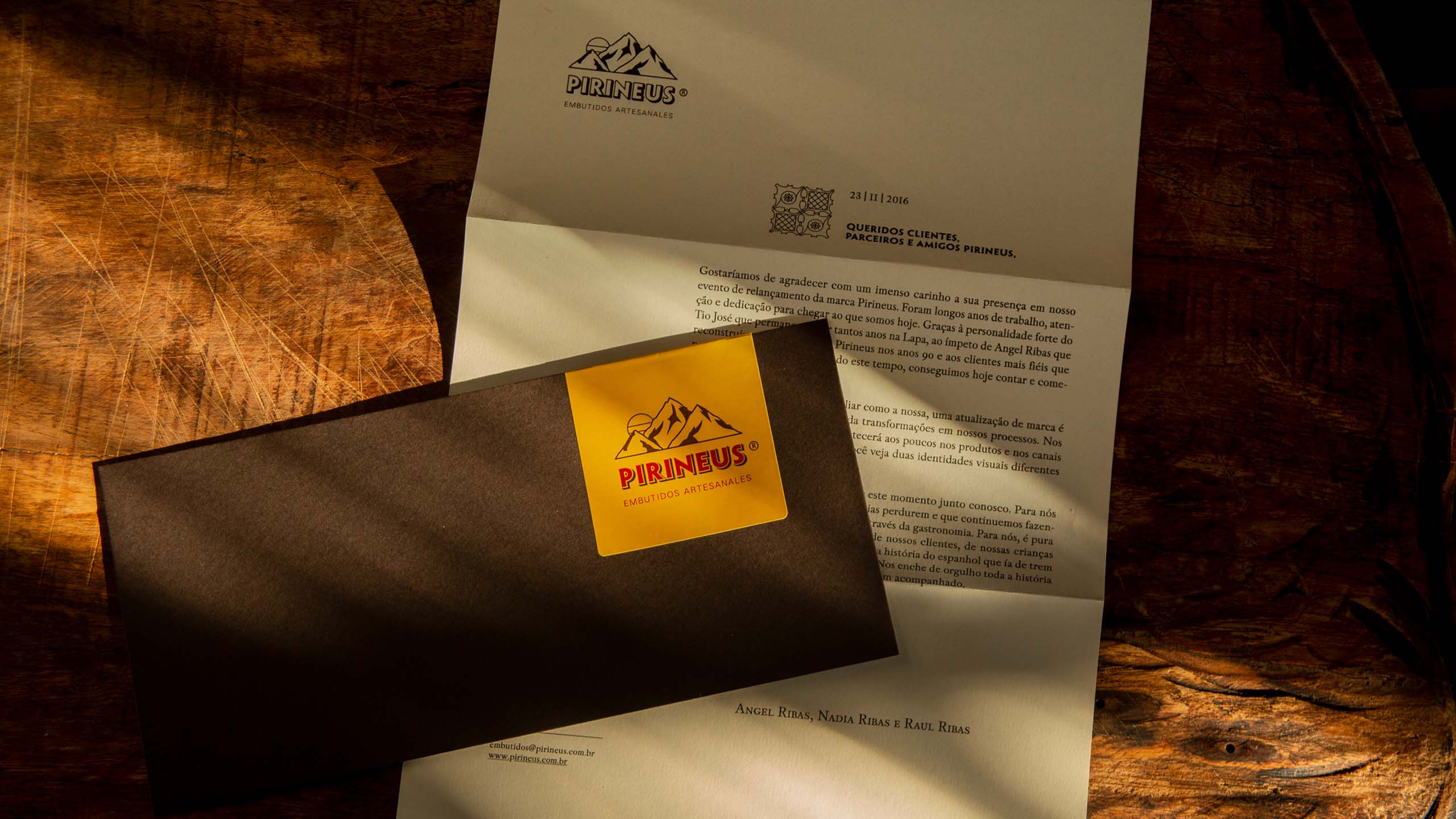
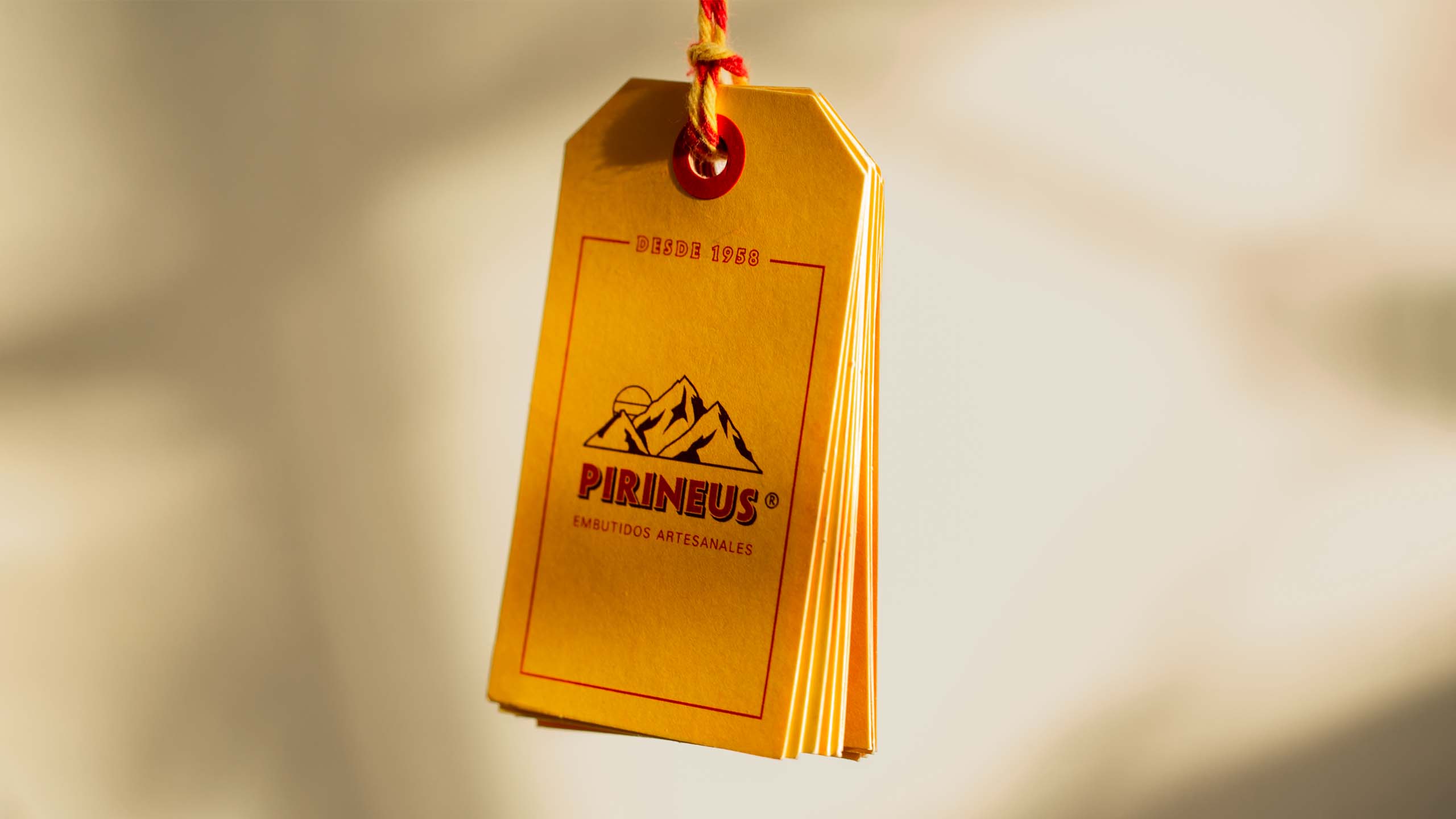
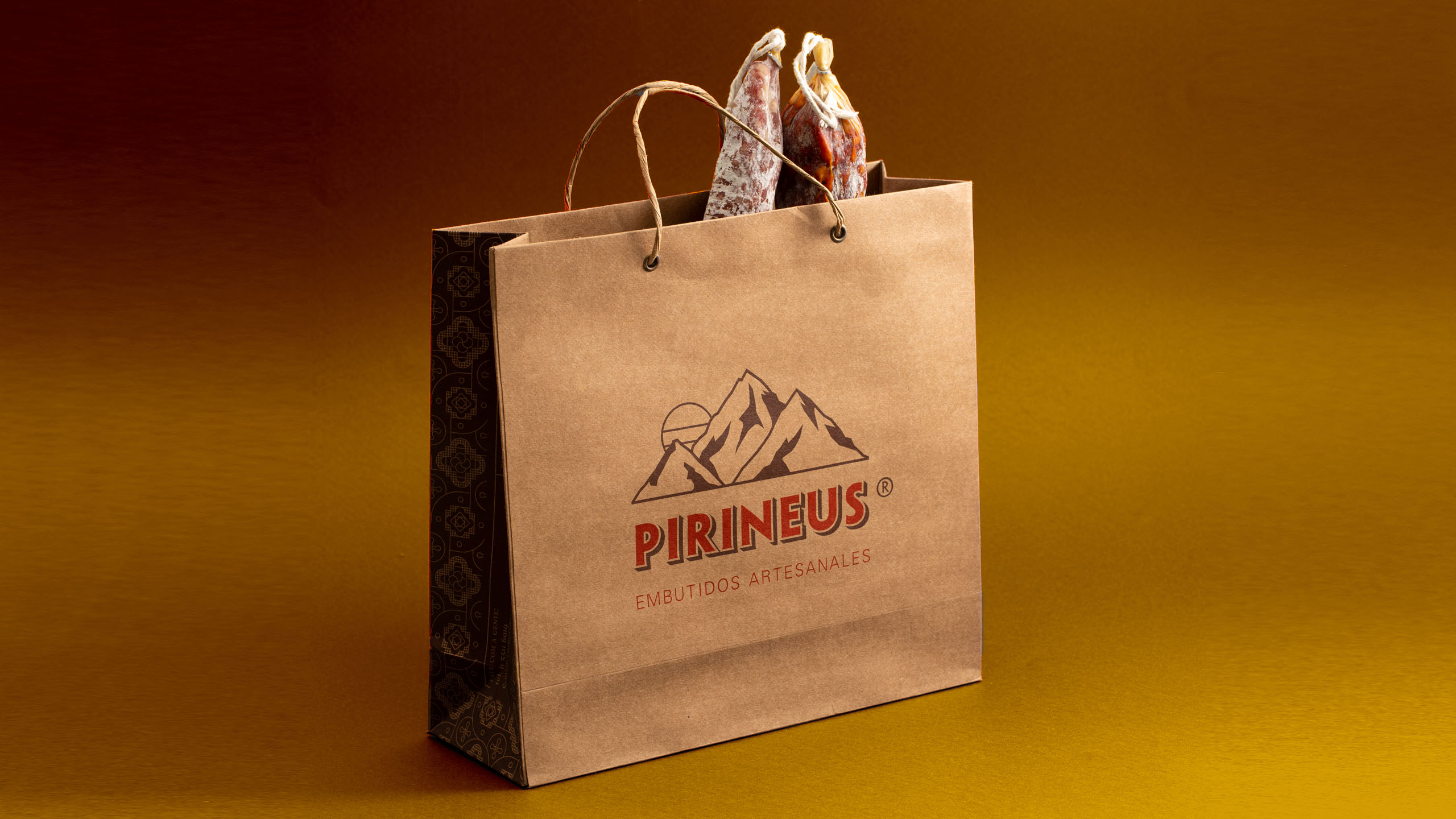
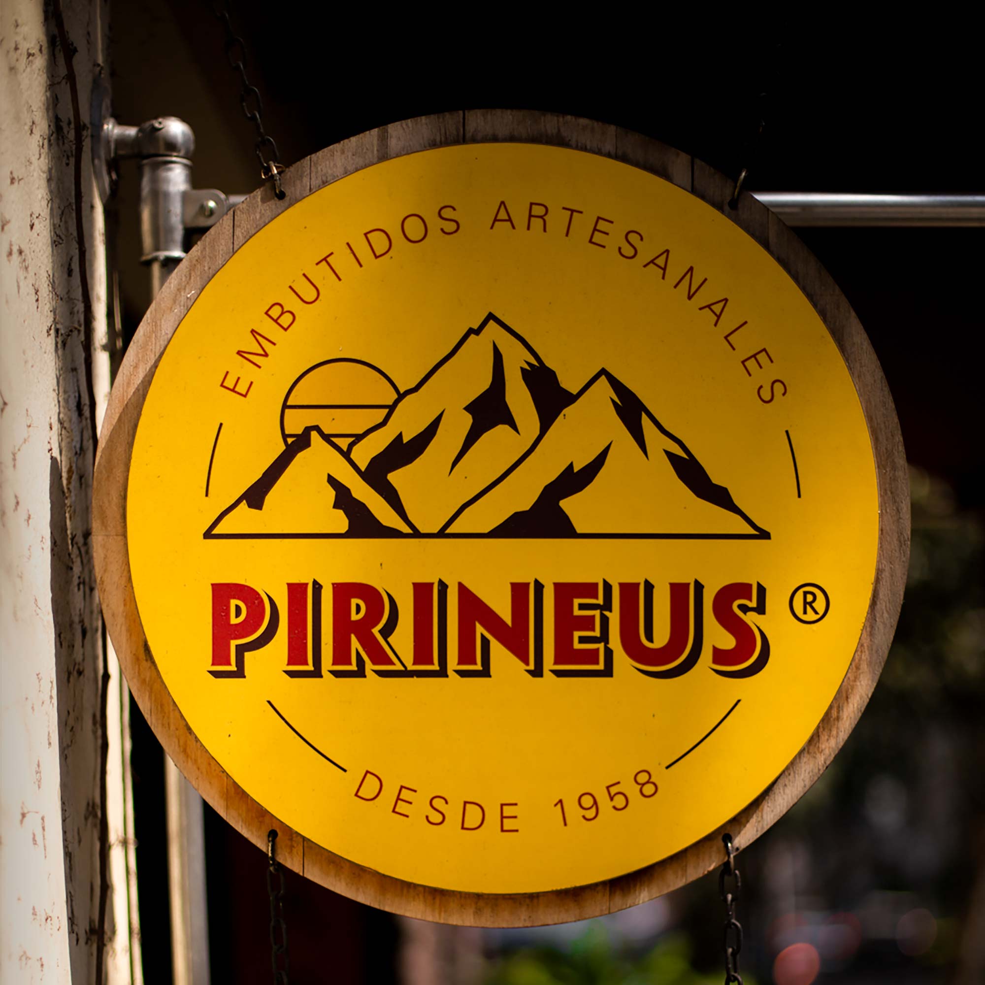
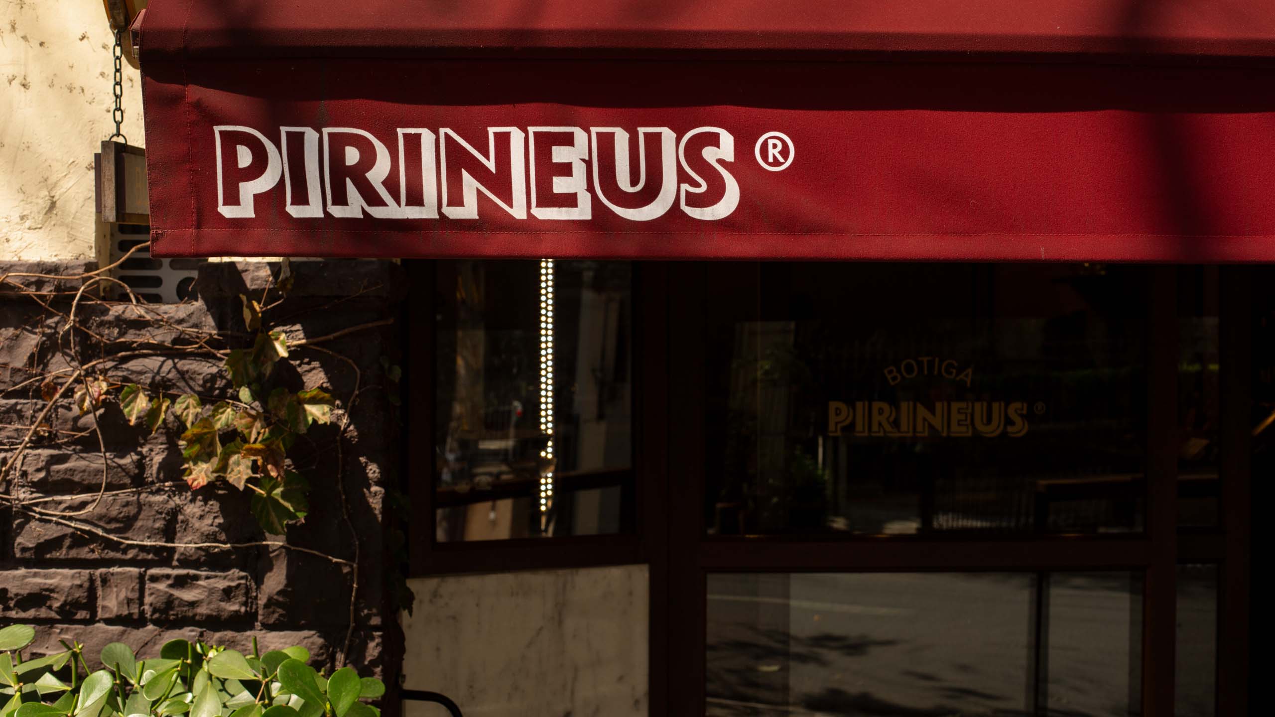
We redesigned Pirineus' mountains symbol with a simple and easy-to-apply vector line. The wordmark was inspired by the signs of Spanish botigas and uses a font that mixes serif and sans serif styles. Two other typographies complete the visual identity: Pradell, a Catalan serif font that references the history and origins of Pirineus, and Univers, a modern and flexible font that makes it possible to create clear hierarchies for secondary and technical information.
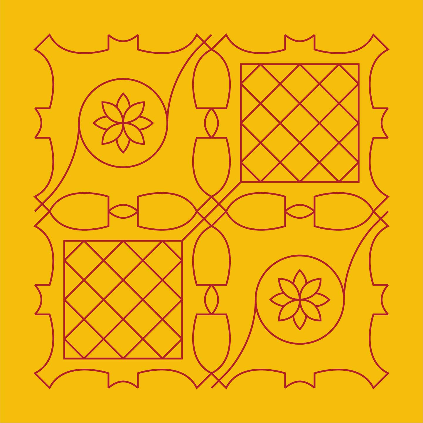
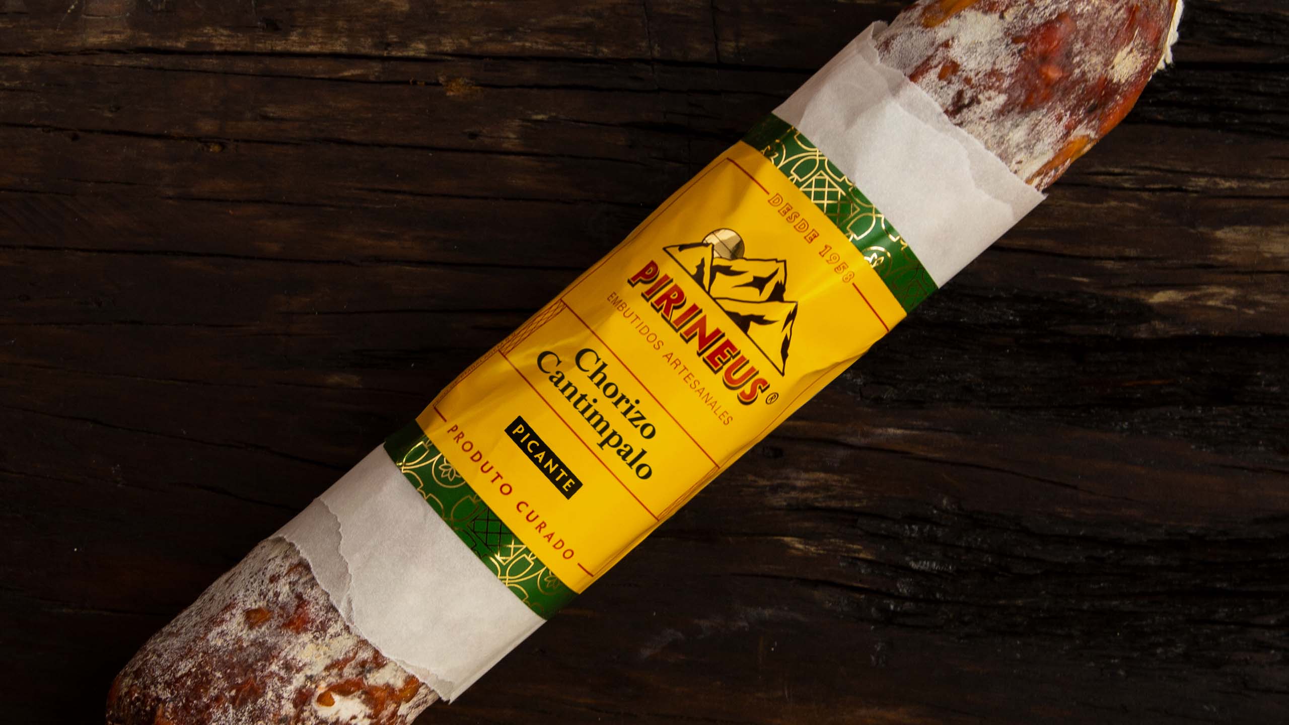
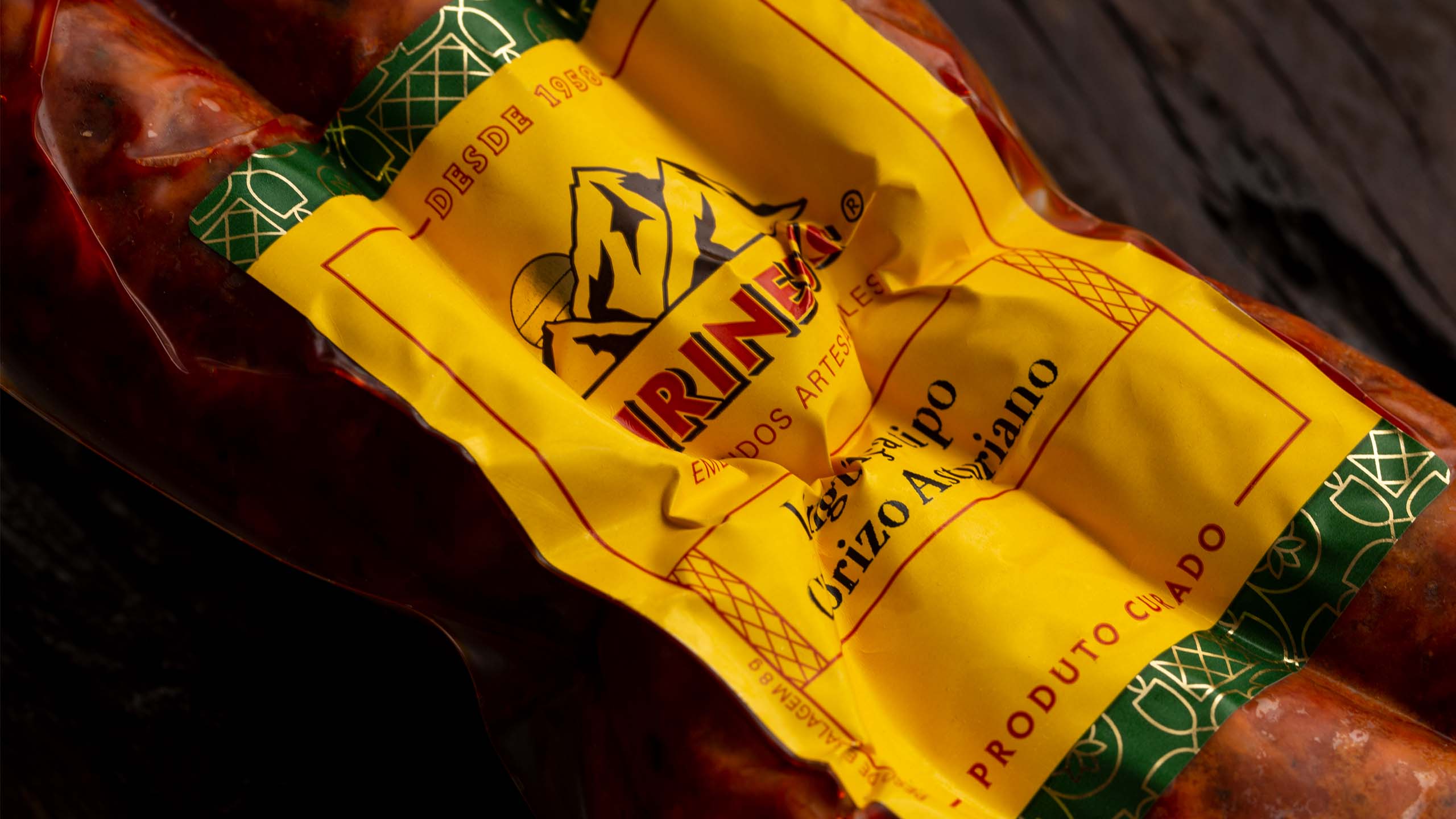
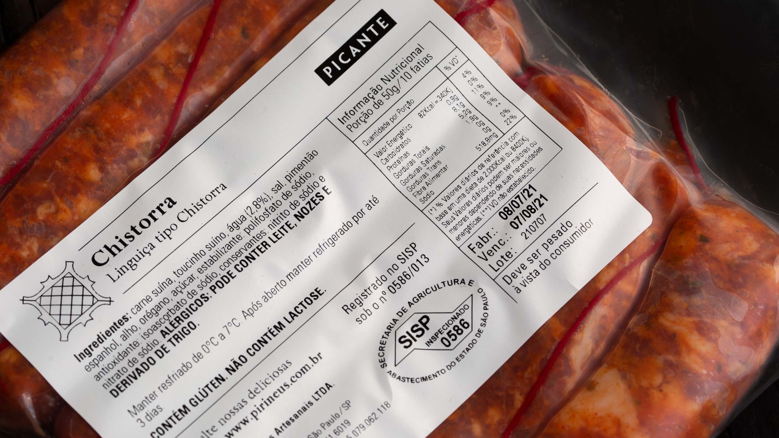
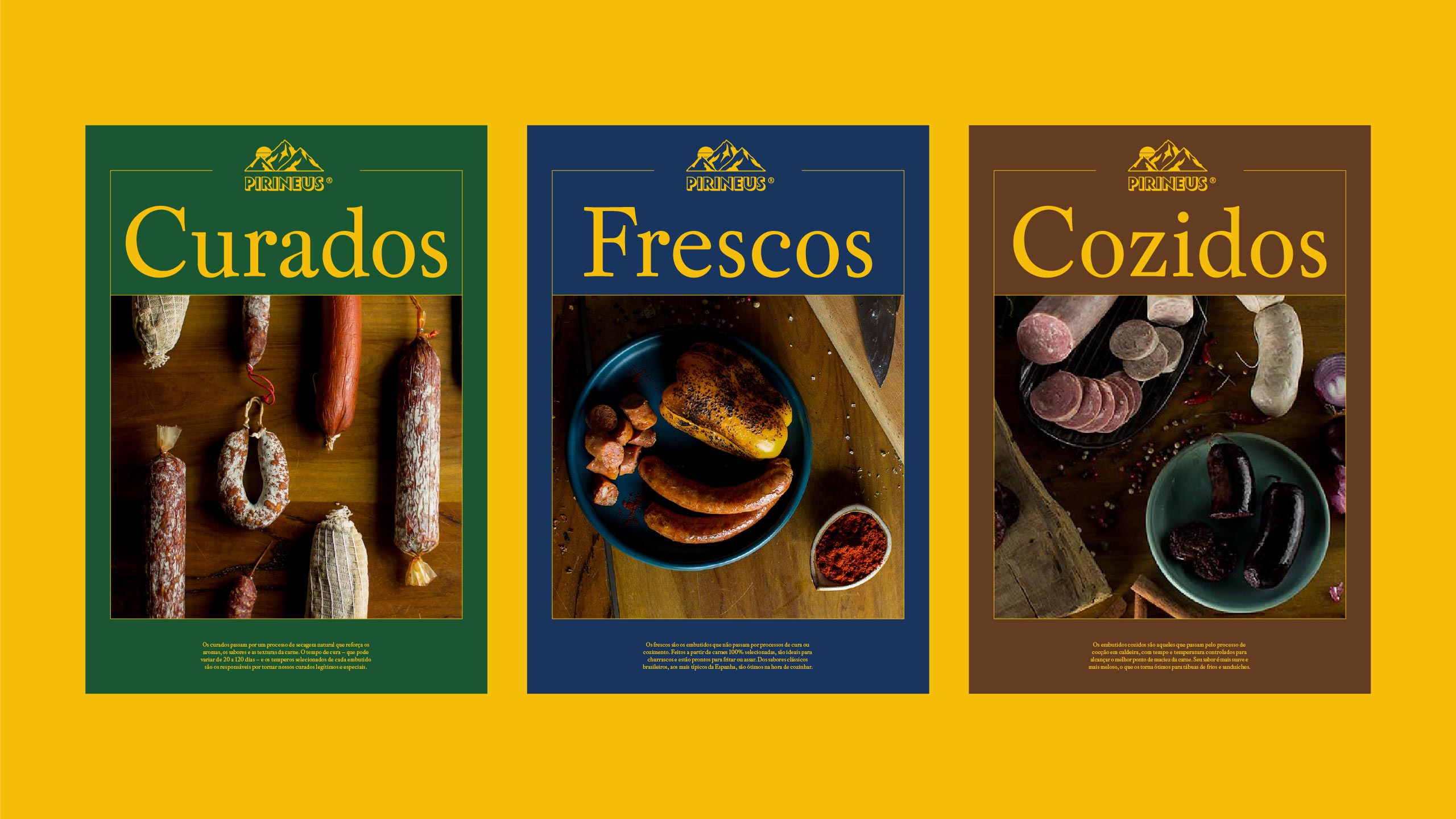
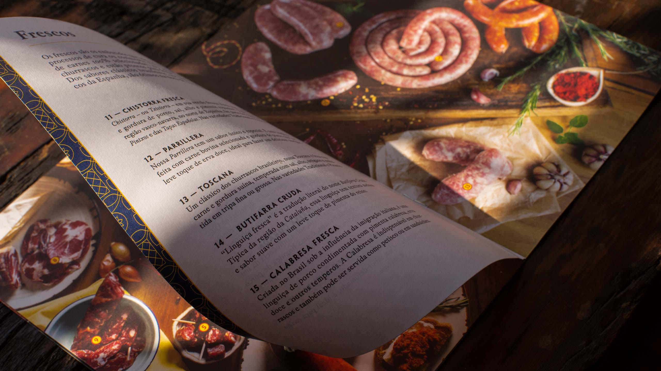
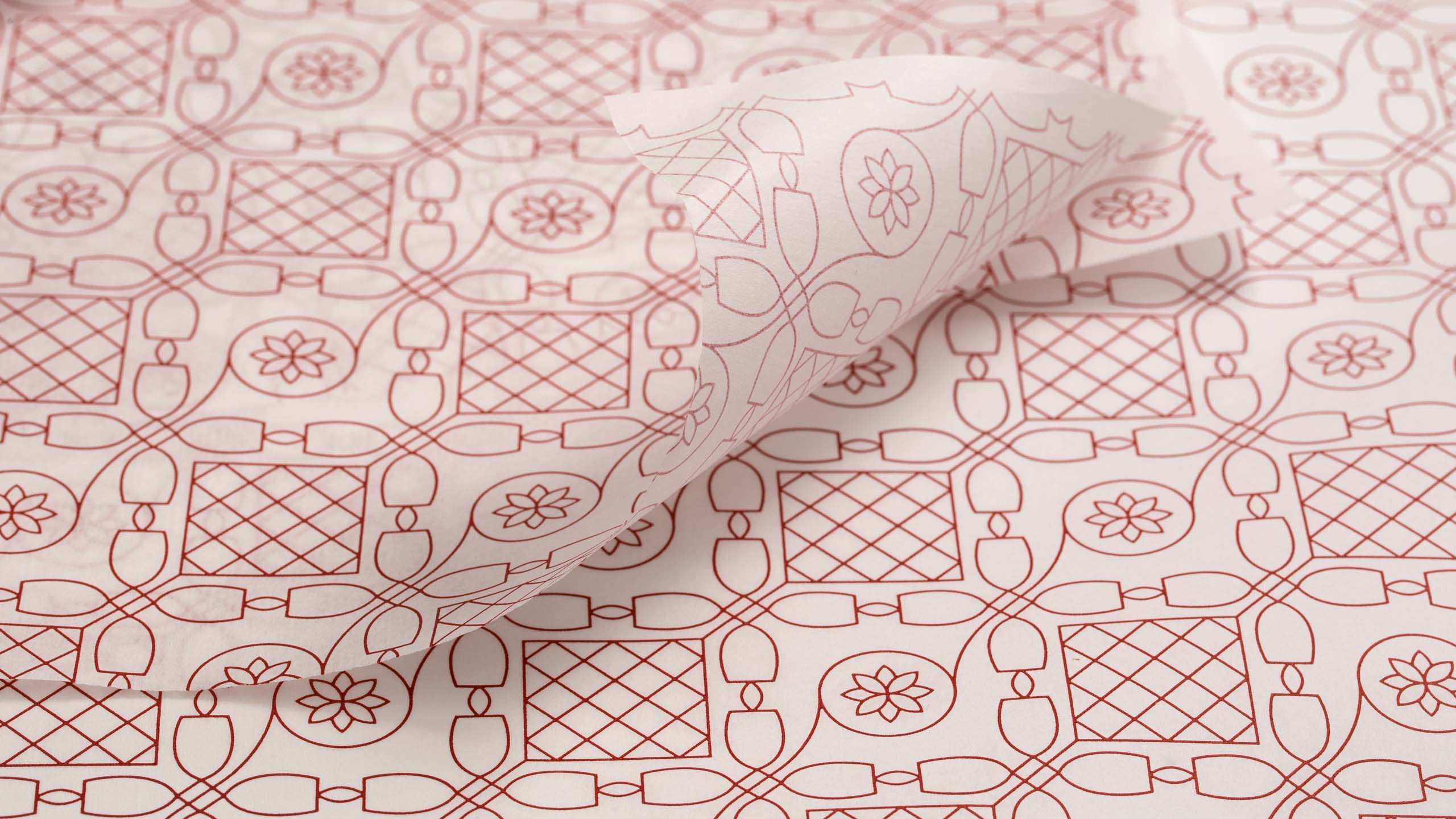
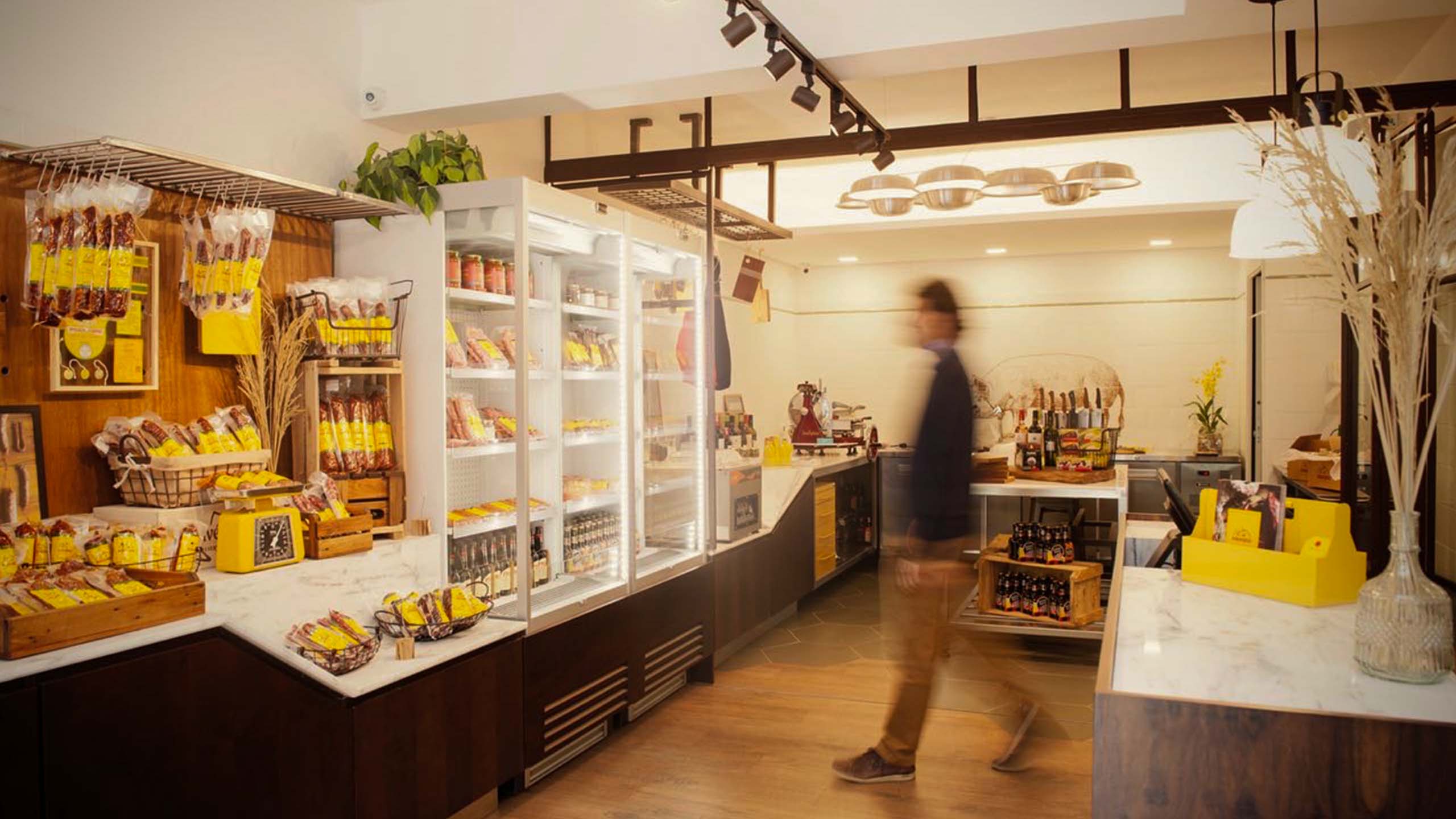
Patterns inspired by Catalan tile designs work as frames that evoke nostalgia for traditional elements. On product labels, some of these patterns gain an even more special appearance through the use of golden finishes. The color palette derived from the Spanish flag has yellow as its main tone. In addition, it considers three colors to arrange the product lines: green for cured sausages, blue for fresh sausages and brown for cooked sausages. Reimagined traditional elements, clean compositions and imagery that values warm textures are the ingredients of a visual language that exalts the history of the Pirineus and prepares the brand for another sixty years of life.
Credits
Design
Lucas Andrade, Murilo Fonseca, Victor de Bone
Store photography
Vanessa Zanforlin
Photography
Henrique Peron
Case study photography
Ricardo Toscani
