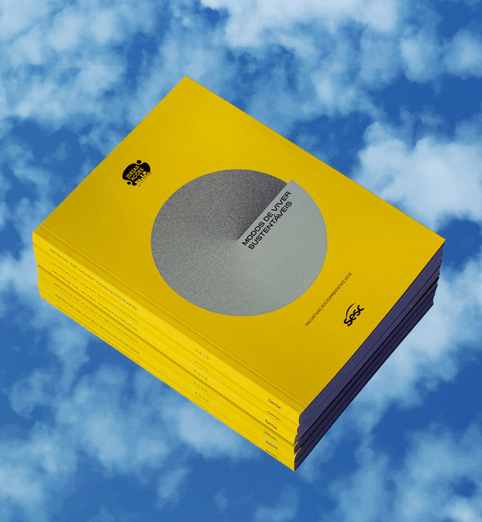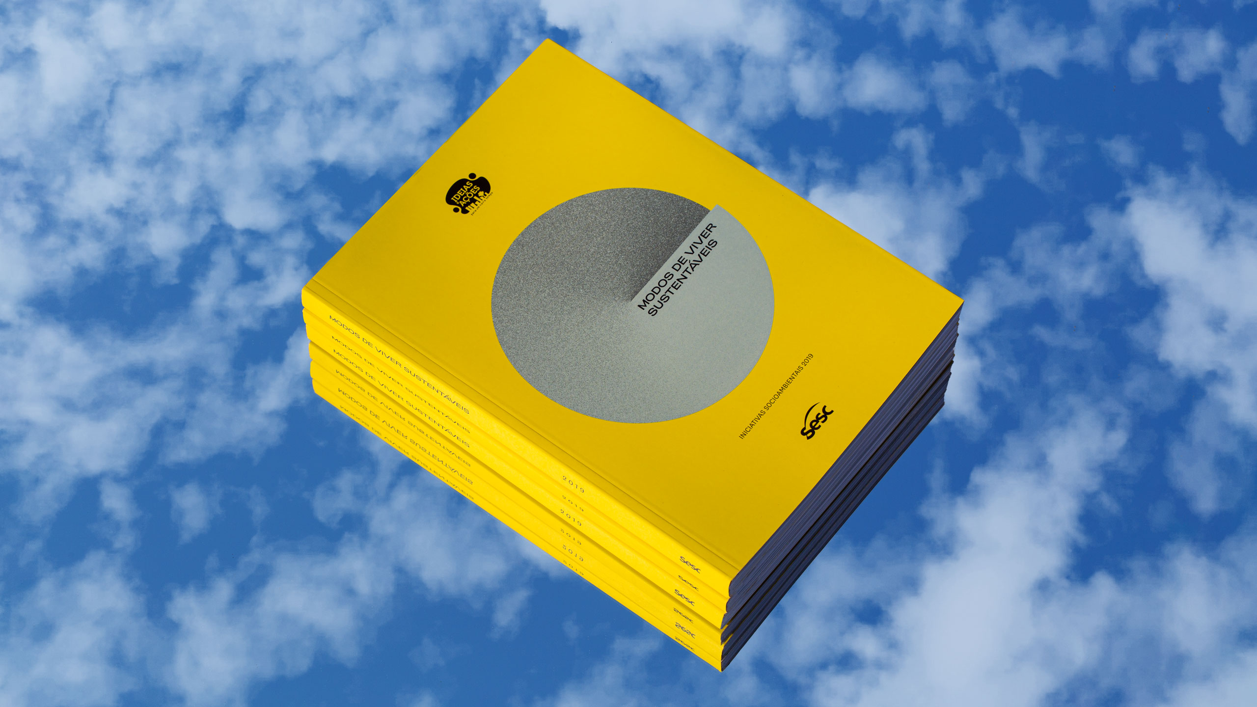
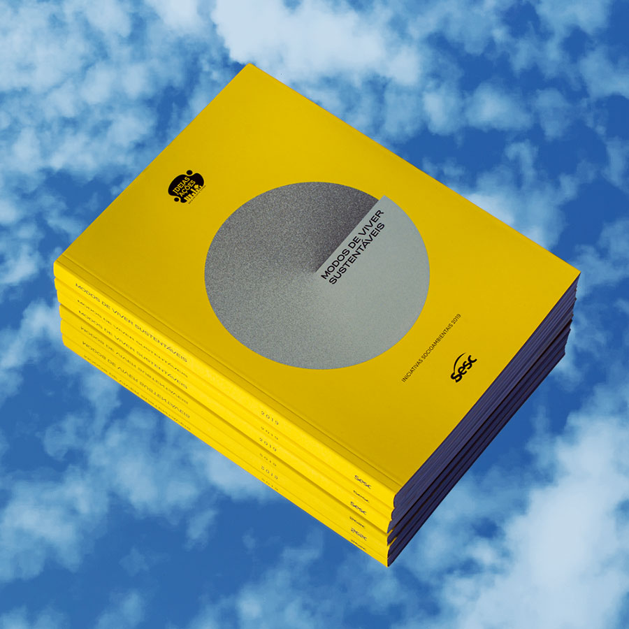
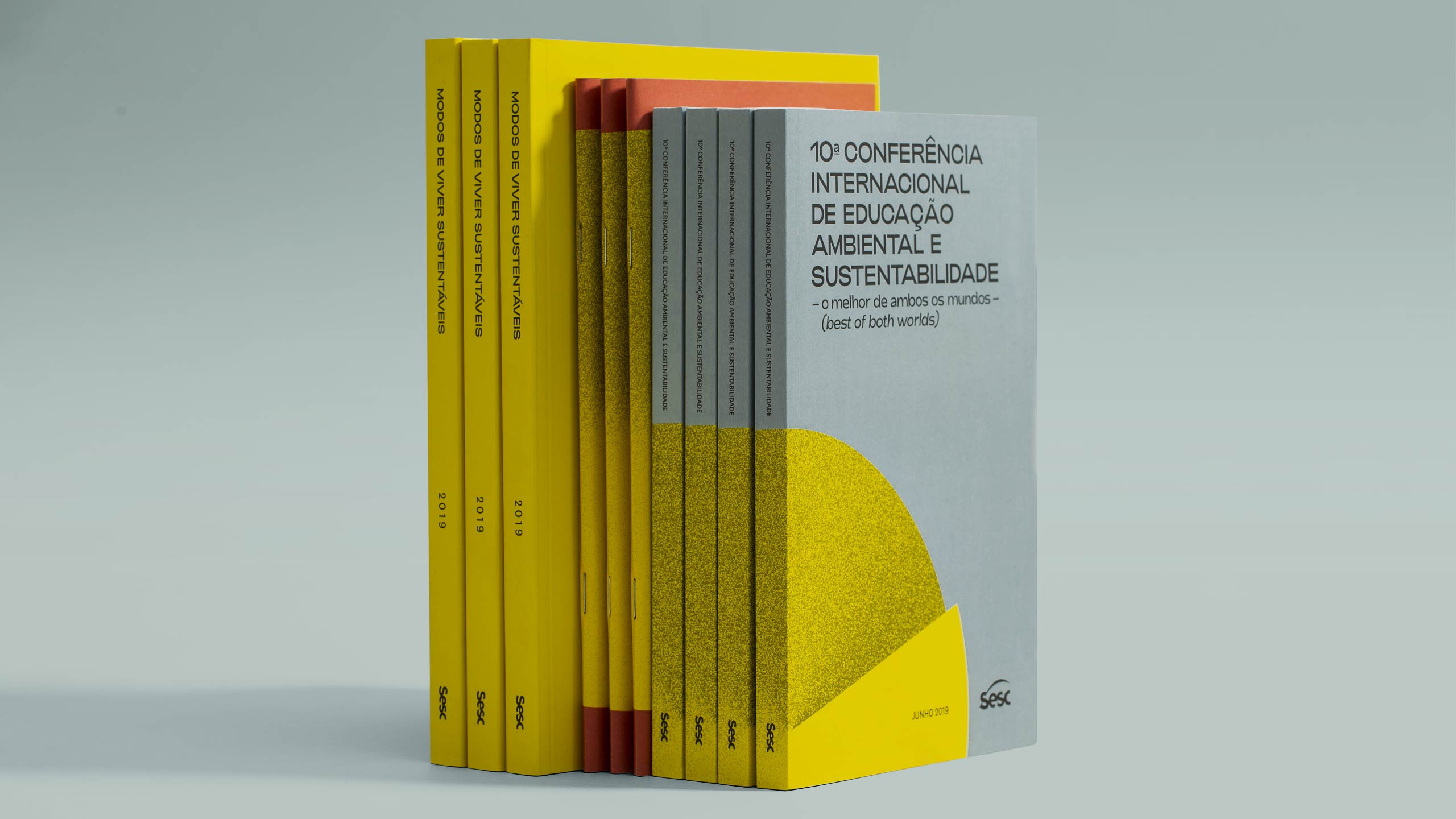
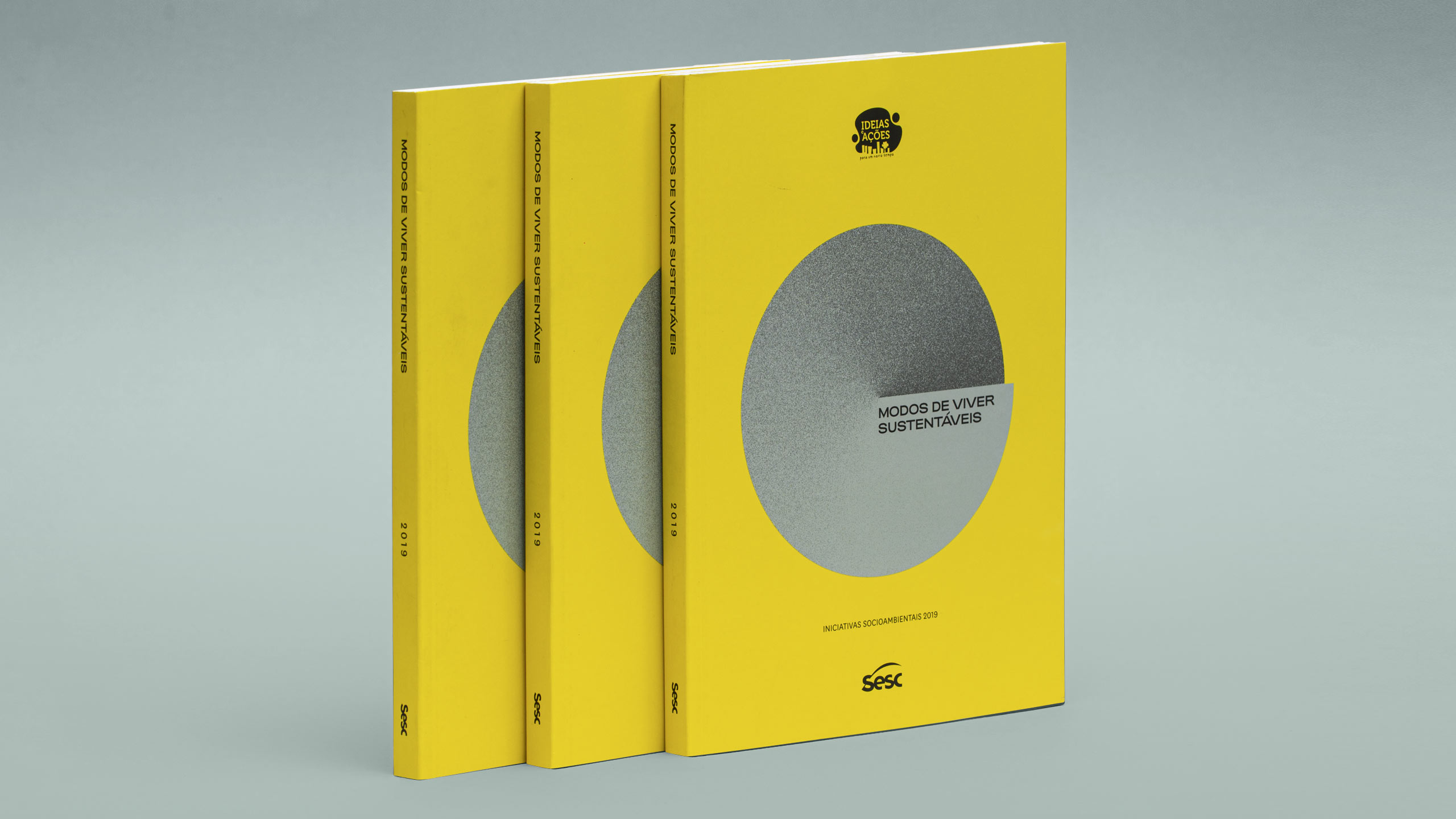
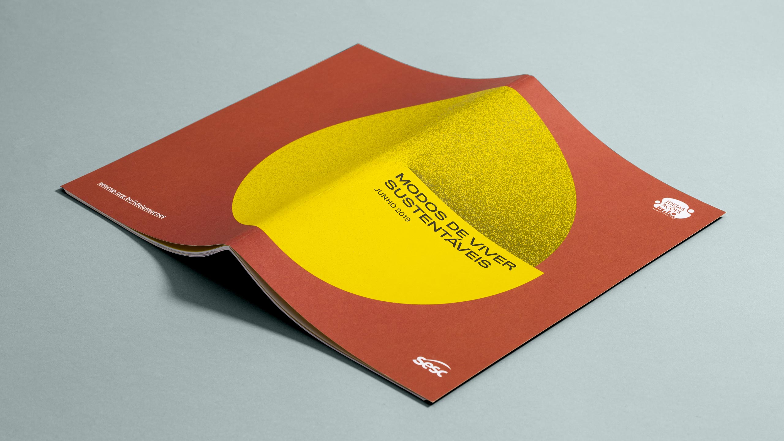
Modos de Viver Sustentáveis Sustainable Ways of Living, the 2019 sustainability theme of Sesc Sao Paulo, presents proposals to organize our lives in balance with social and environmental issues. From a basic element, we created a simple and broad visual language that ilustrates the idea of balance and includes the different socio-environmental universes that inhabit the main theme.
EDITORIAL
2019
Info
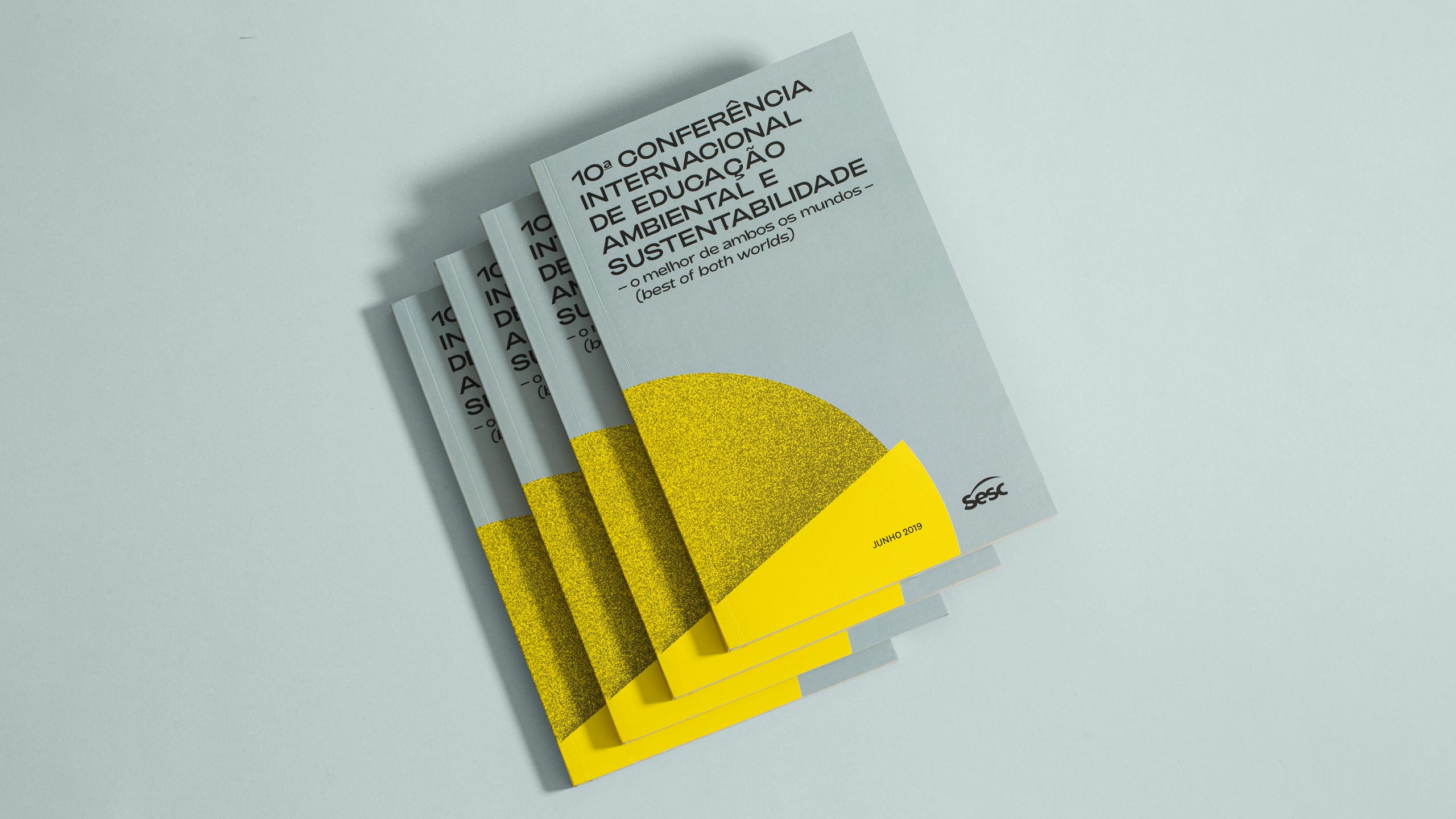
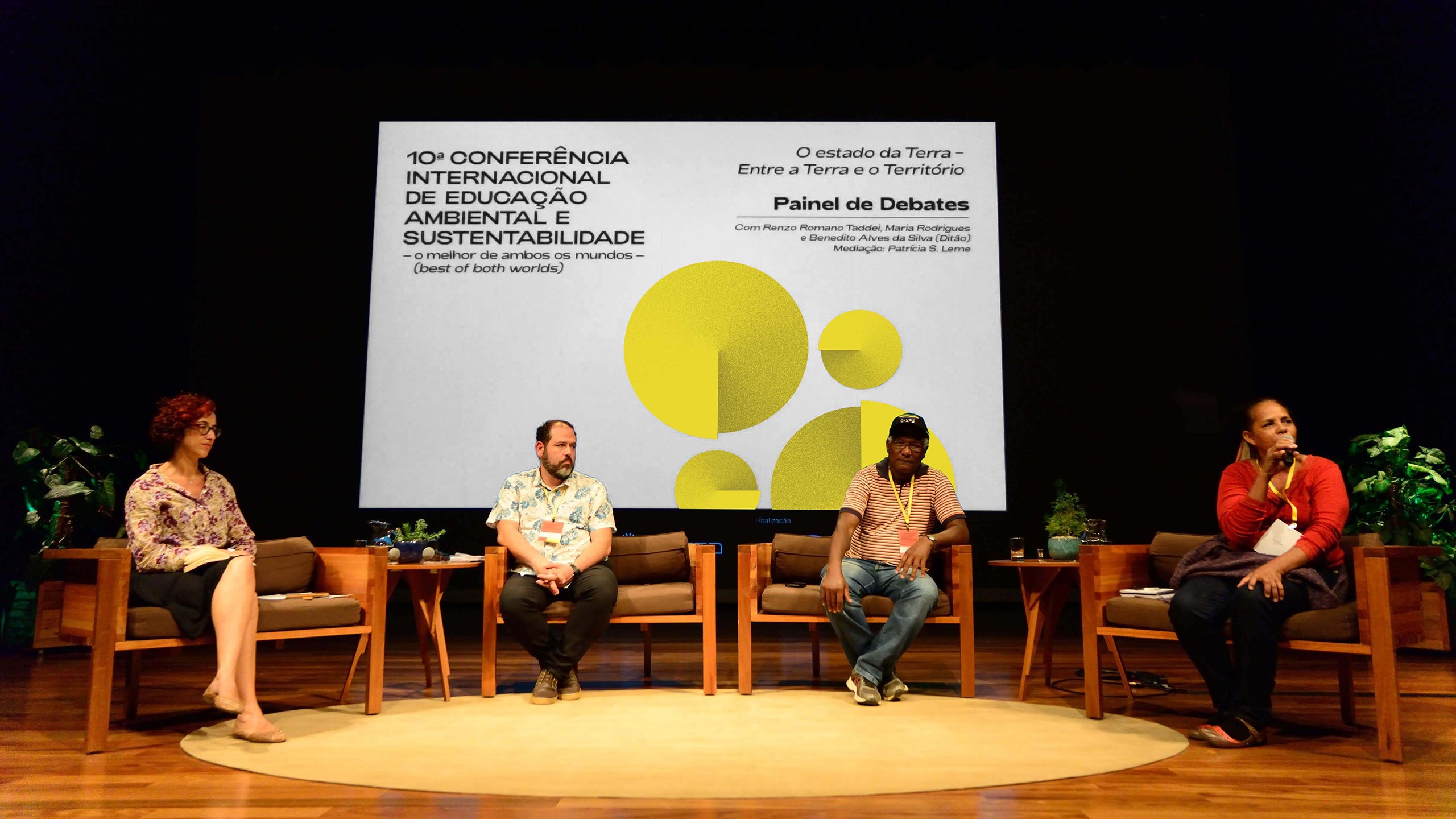
Since 2016, through the project Ideas and Actions for a New Time, Sesc Sao Paulo have mapped local socio-environmental tha have educational potential and respects environment and cultural diversities. In 2019, we were invited to create the visual identity, the catalog and the logo of a international convention for the theme “Modos de Viver Sustentáveis" (Sustainable Ways of Living).
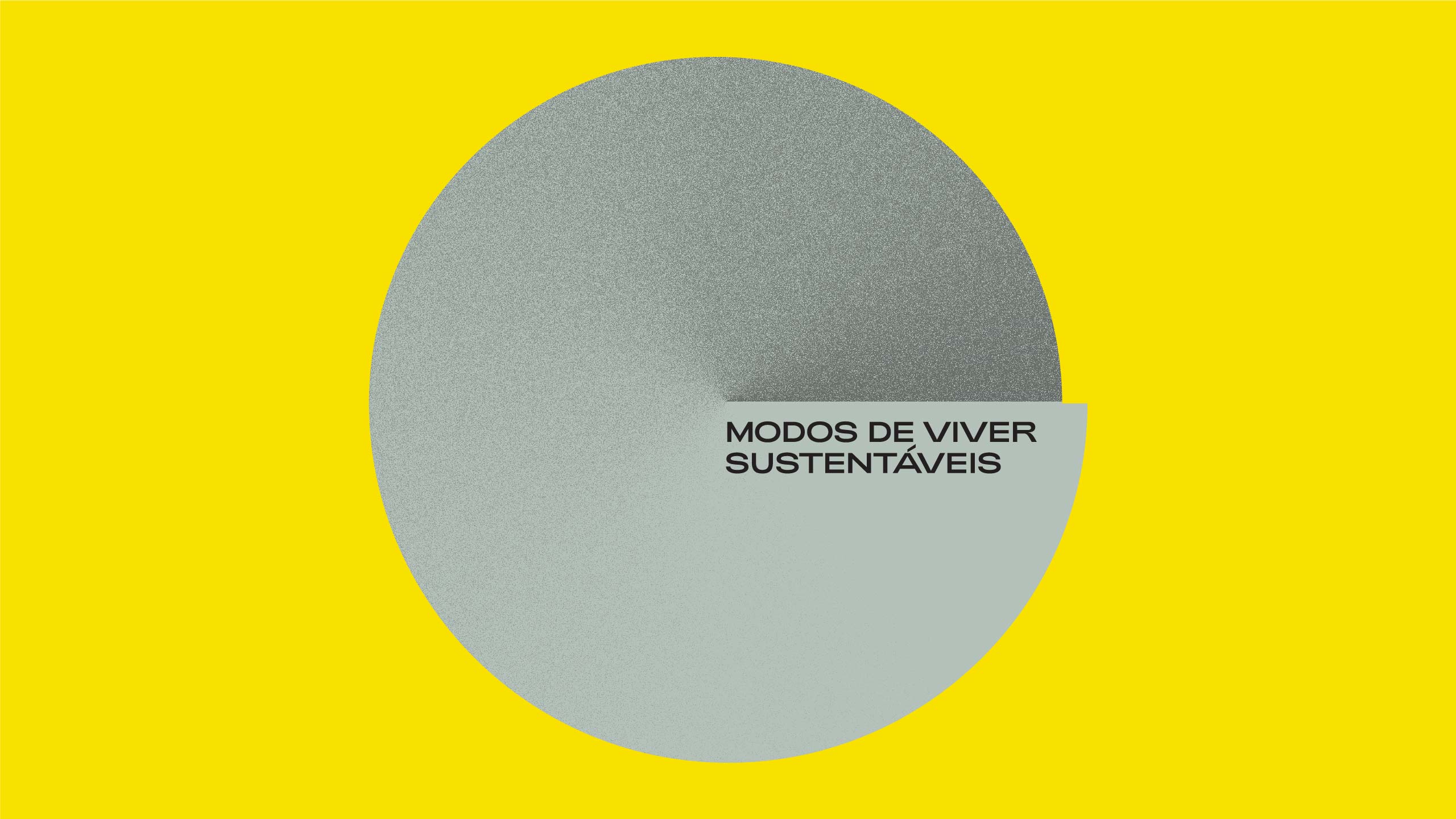
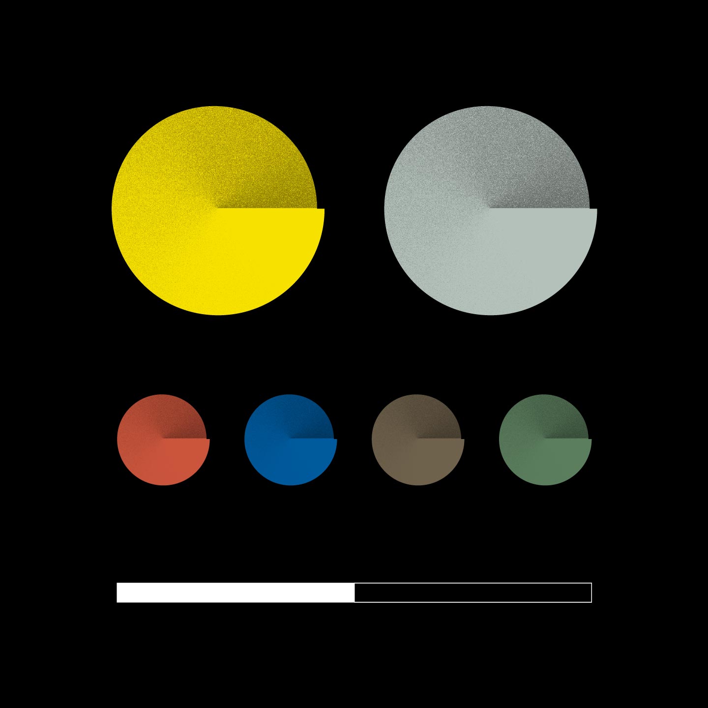
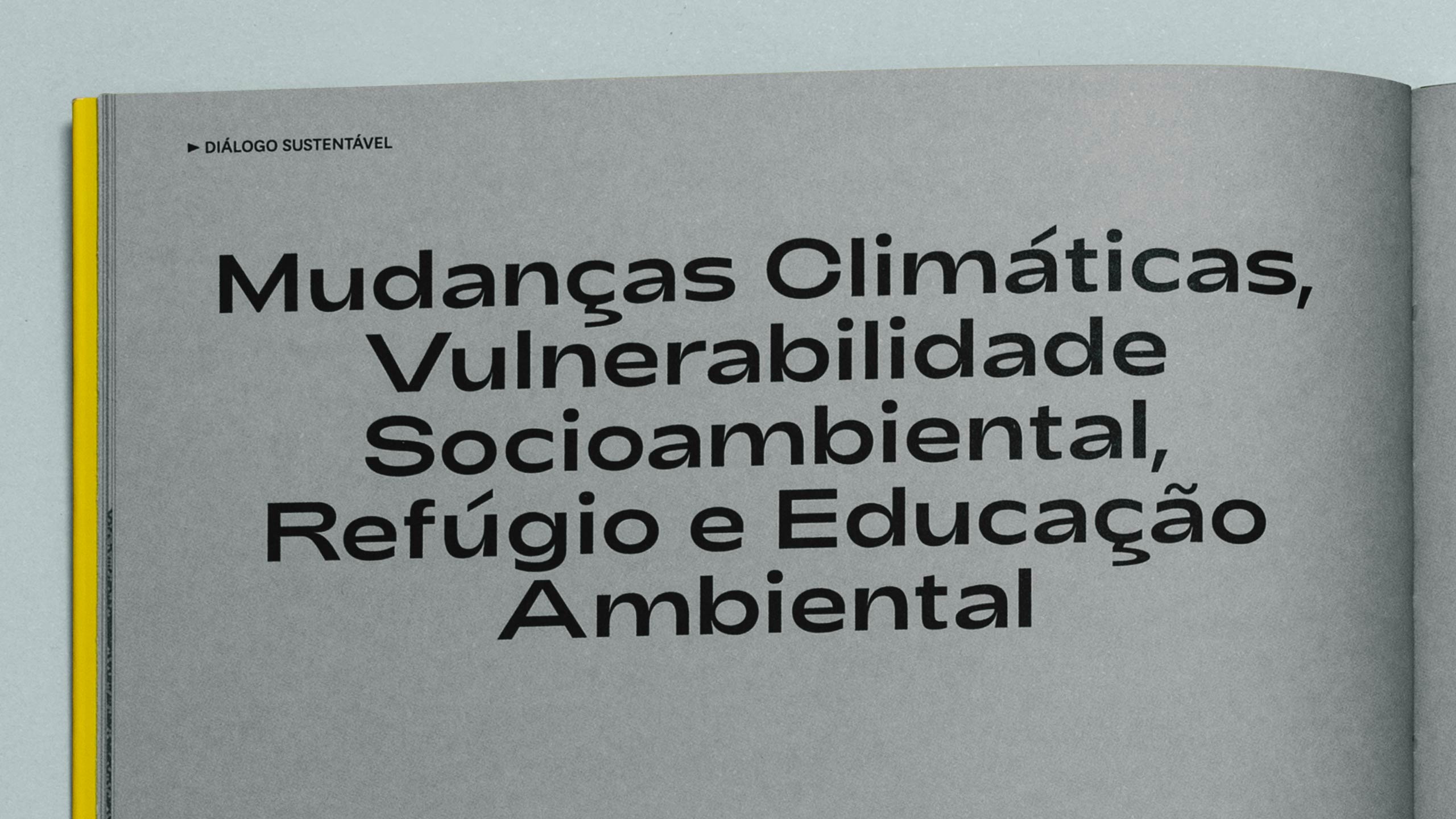
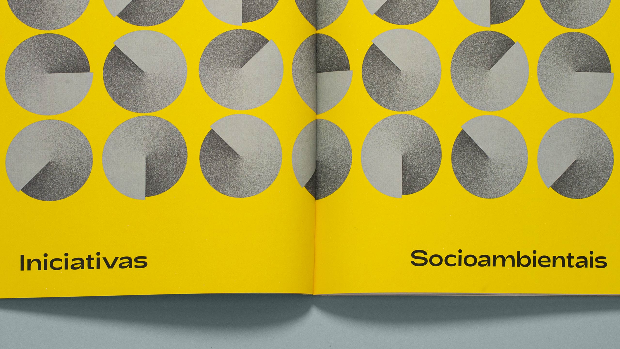
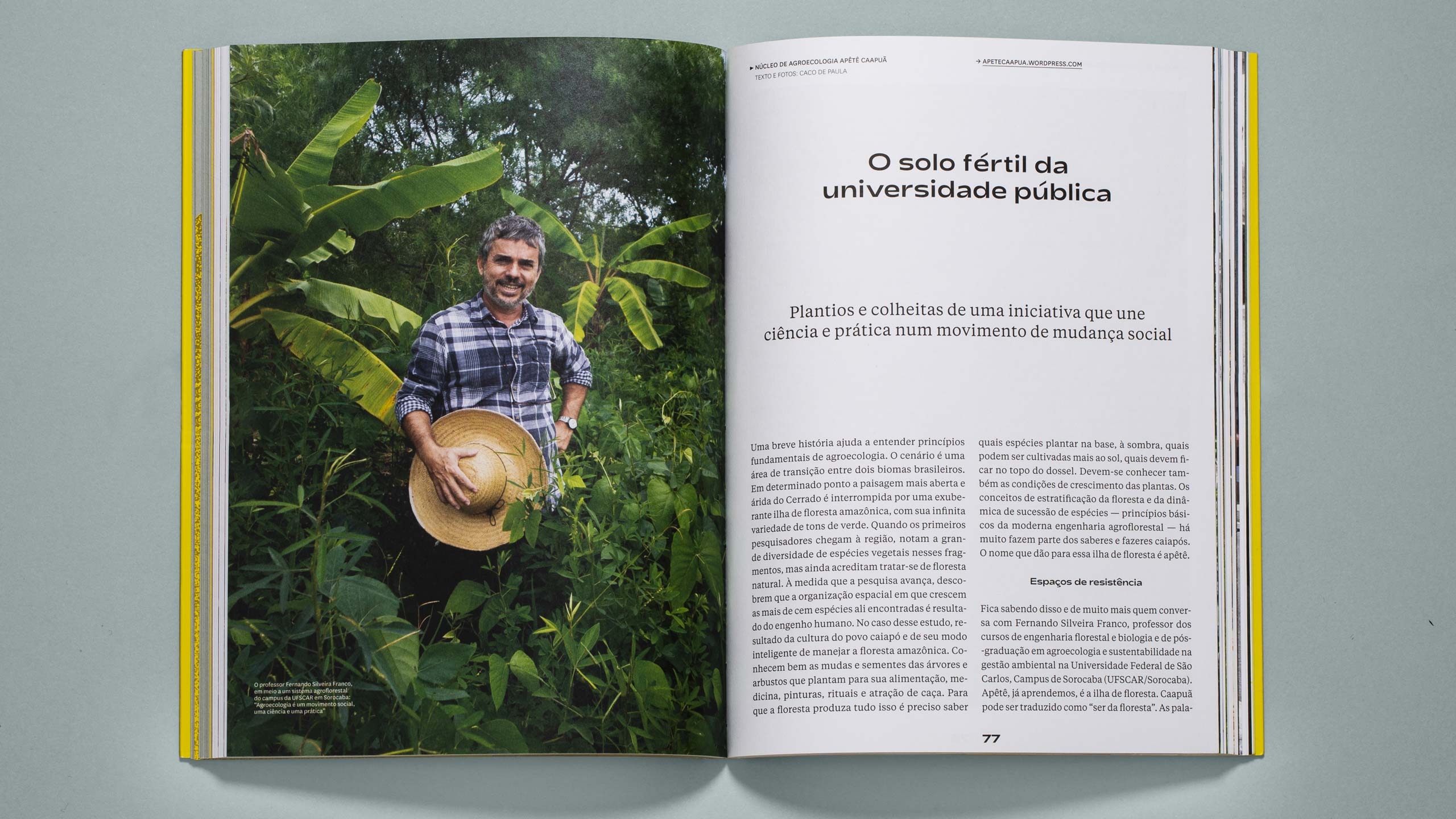
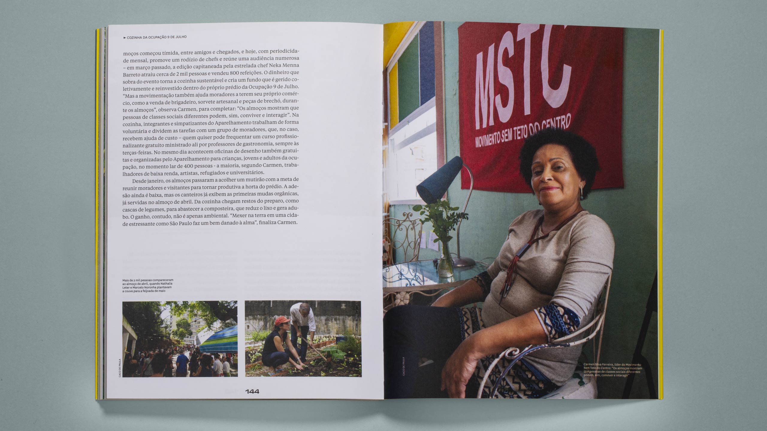
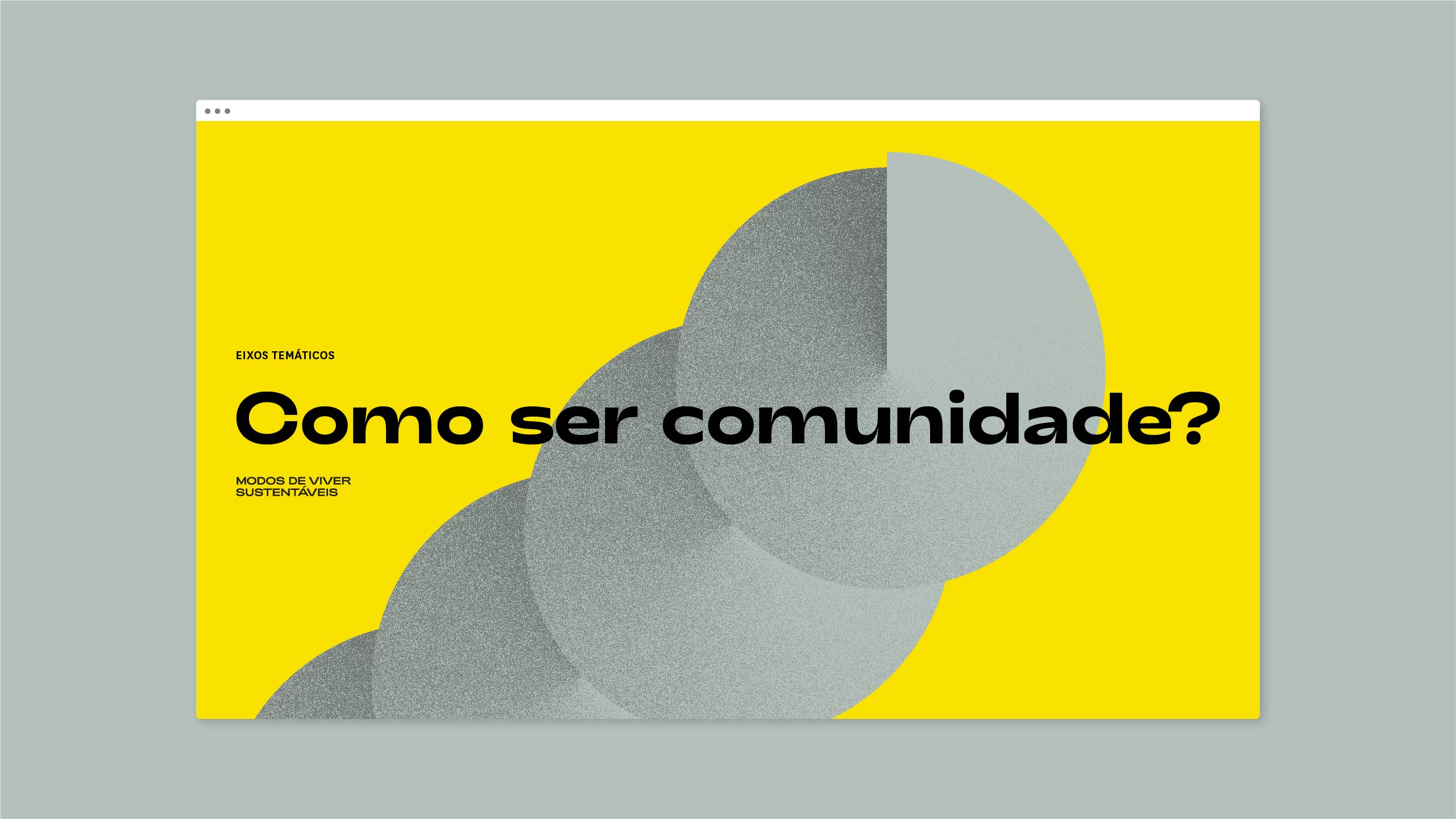
Representing such a broad mapping, which includes different initiatives like agroforestry and occupation of public spaces, requires a good level of abstraction. Starting with the idea of tension between unbridled consumption and balanced coexistence, we worked with contrast in a circle as our main element. The gradient, which goes from the darker side to the lighter side, represents the dialogue and the evolution of ideias, while the spiral shape seen from above conveys continuity and movement. The result is a dynamic and flexible graphic element.
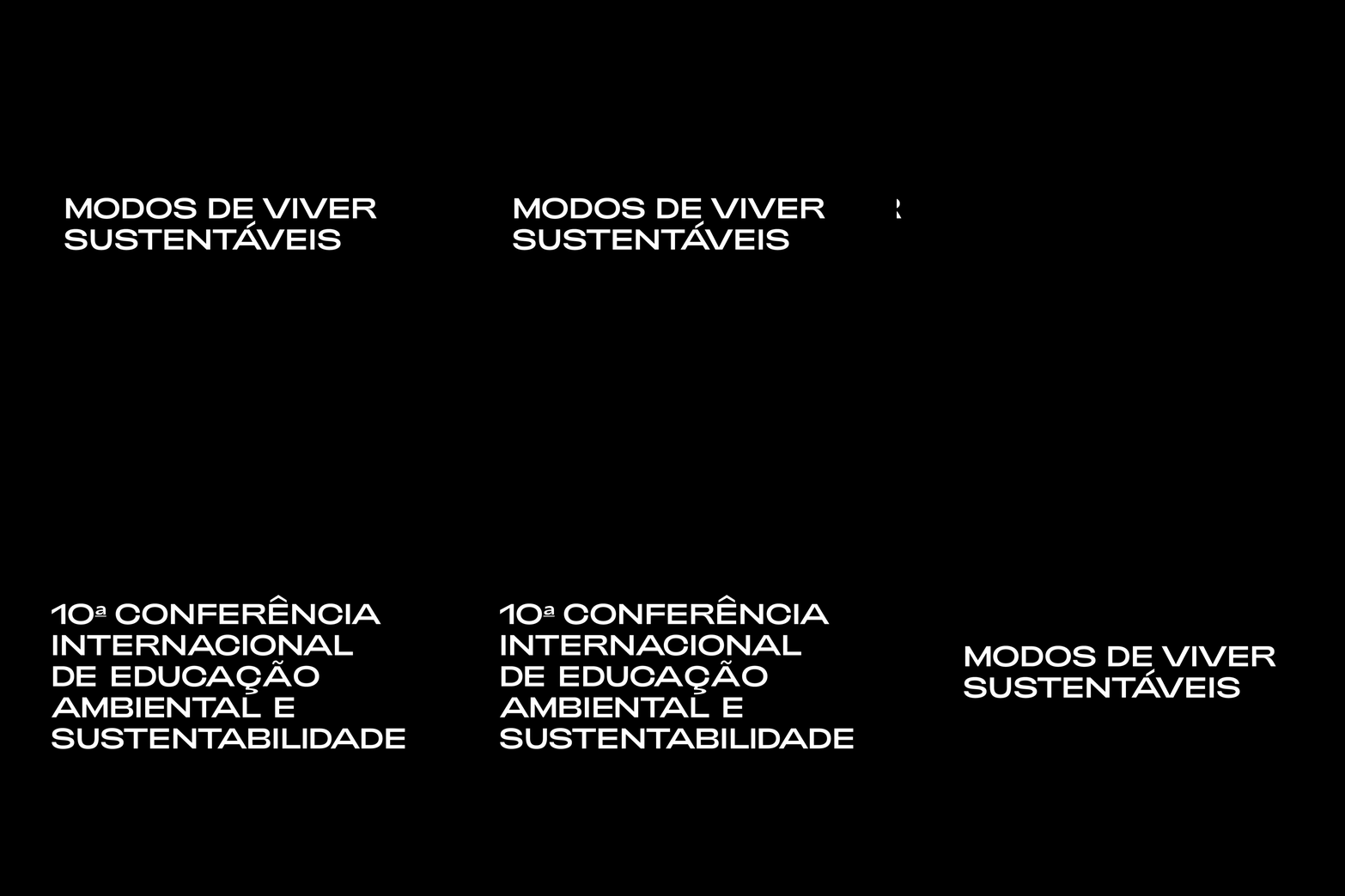
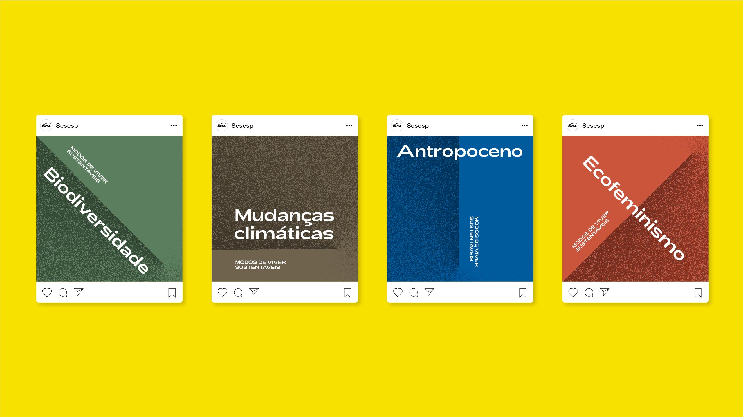
For the colors, we've combined yellow and gray to create a high-contrast and energetic palette not commonly found in sustainability visual projects. Complementary colors allow new combinations and reinforce the diversity of the theme. Finally, strong typography for titles completes a simple visual system that is able to group together a wide variety of urgent topics in today's world..
Credits
Design
Lucas Andrade, Murilo Fonseca
Editing
Caco de Paula
Words
Caco de Paula, Ana Paula Orlandi, Otávio Rodrigues, Angélica Queiroz, Julia Fabri e Juliana Amato
Photography
Caco de Paula, Ana Paula Orlandi, Otávio Rodrigues, Angélica Queiroz, Julia Fabri, Juliana Amato, Alex Dias, Gustavo de Faria, Mar Franz Rocha, Raquel Arruda Santos, Edson Dantas/Folhapress, Jorge Araújo/Folhapress
Conference Photography
Sesc SP
Case study photography
Ricardo Toscani
